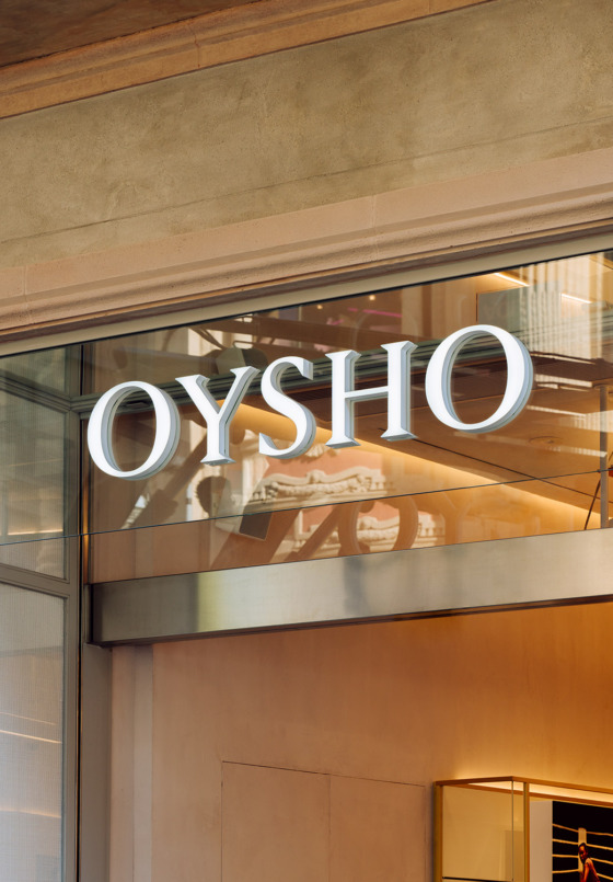


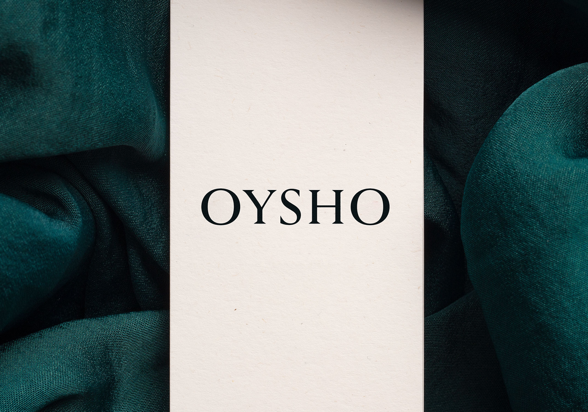
The constant evolution of Oysho’s brand positioning was the starting point for the redesign of its logotype. The brand of the Inditex group needed a more contemporary look in order to successfully integrate its new and innovative product lines.
Maintaining the basic skeleton and the original proportions of the logo was a necessity in order to preserve the brand’s essence. By setting aside the more organic details of the original typography and simplifying the edges, the letters became more forceful and incisive. This exercise in precision was undertaken in collaboration with the typographer Iñigo Jerez (extratype).
Logotype


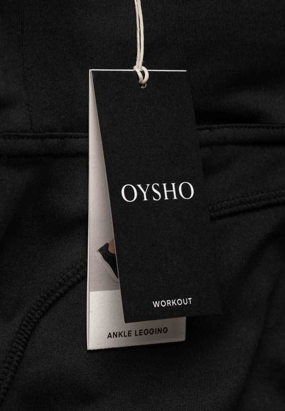
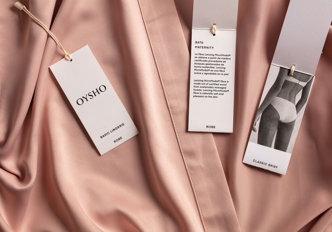
Along with the changes to the logo, a new labeling system was designed, and a secondary typeface was defined for all communication elements.