


Kave Home is a furniture brand rooted in Mediterranean culture since its foundation in Sils. With strong local and international projection, it needed a new creative direction to redesign its identity and expand its brand universe, aiming for a more consistent and distinctive character.
Creation of the new identity and definition of the essential guides of narrative and art direction: Clase
Client strategic consultant: Arturo Bascuñana
Copywriter: Elisabeth Turnor
Images and texts developed by Kave Home’s in-house team based on the new identity.
Identity
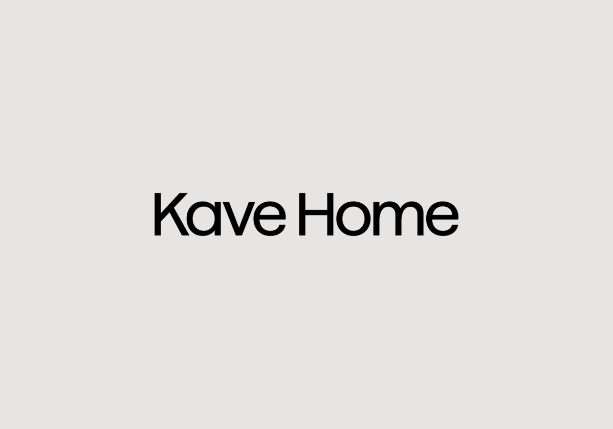
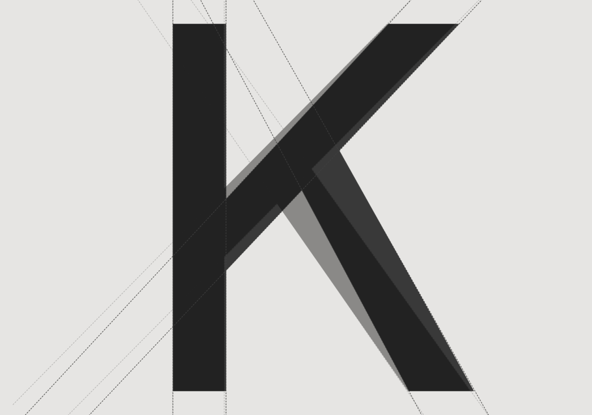
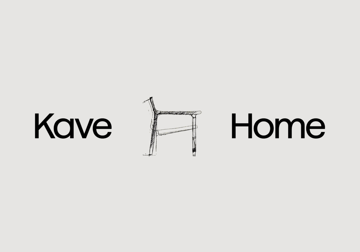
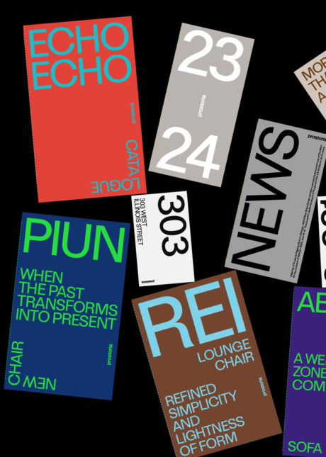
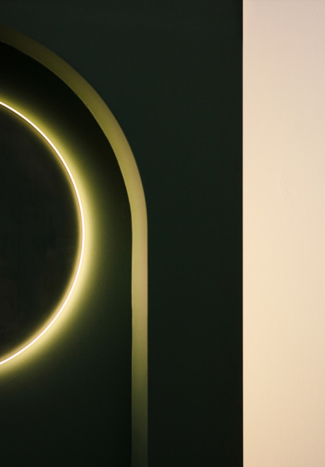
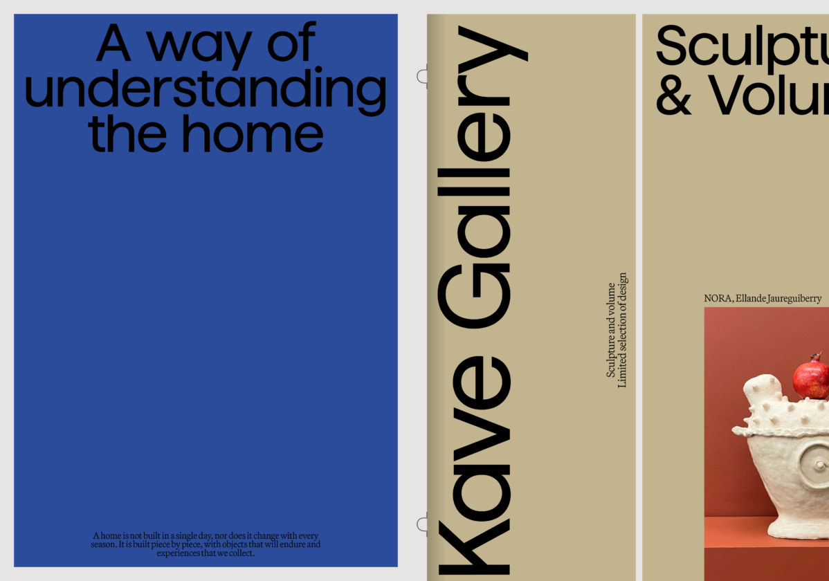
The new identity defines a compact yet flexible and light logo, designed to highlight the brand name over its descriptor, with the long-term aim of establishing the brand simply as “Kave.”
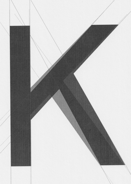
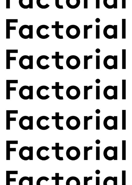
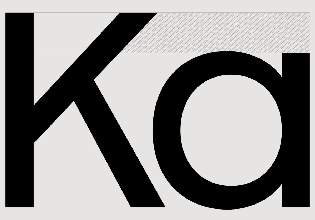
The basic typography combines excellent readability with harmonious, contemporary geometry and a friendly character. To build the logo, we modified elements of the Haffer typeface from Displaay Type Foundry, creating a custom typeface exclusively for Kave.
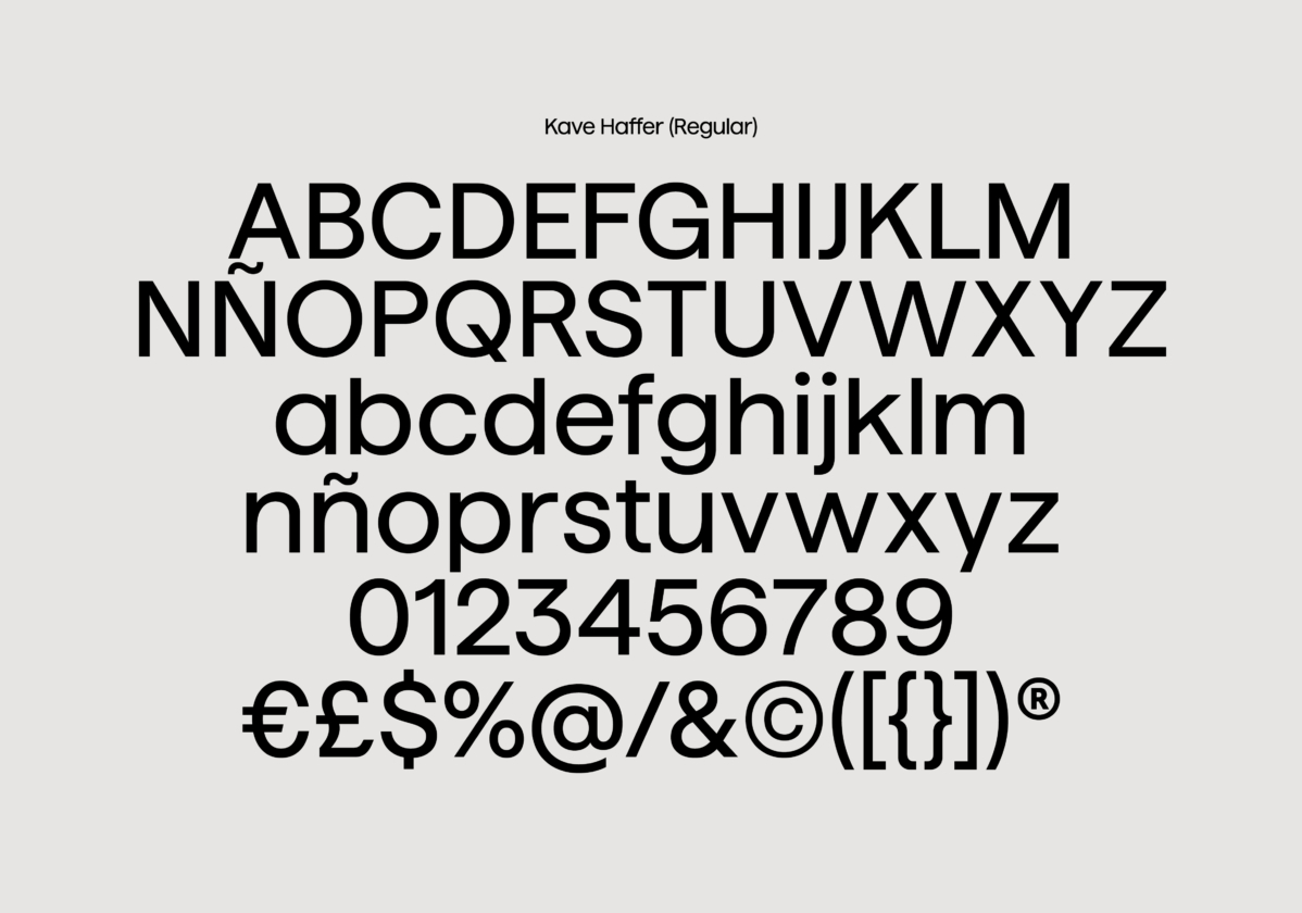
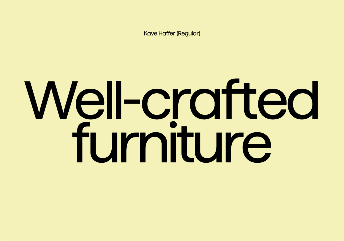
Customized Typography
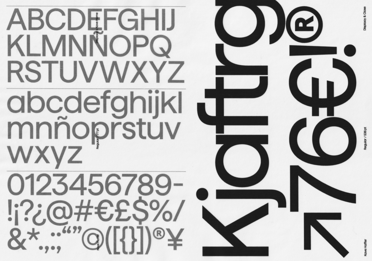
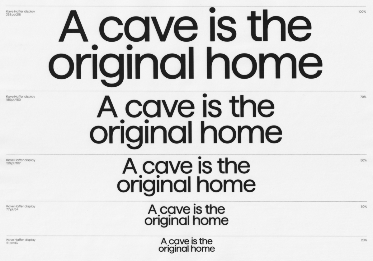
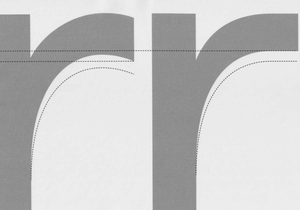
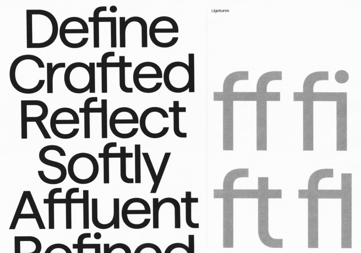
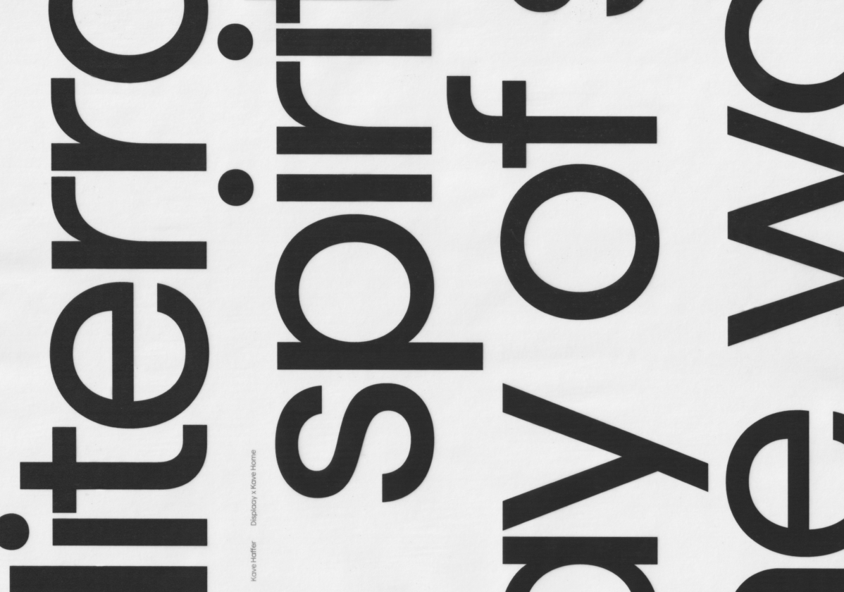
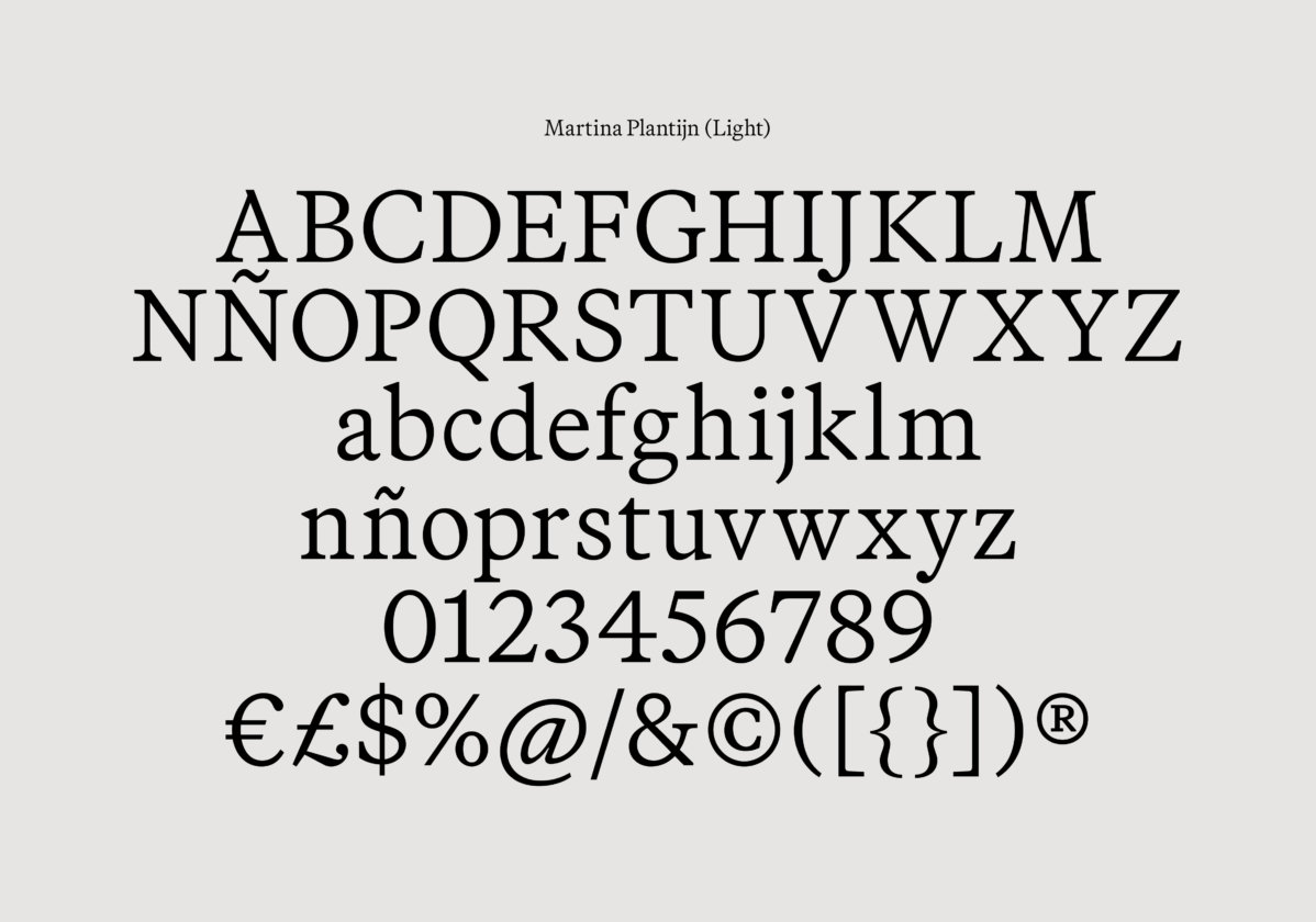
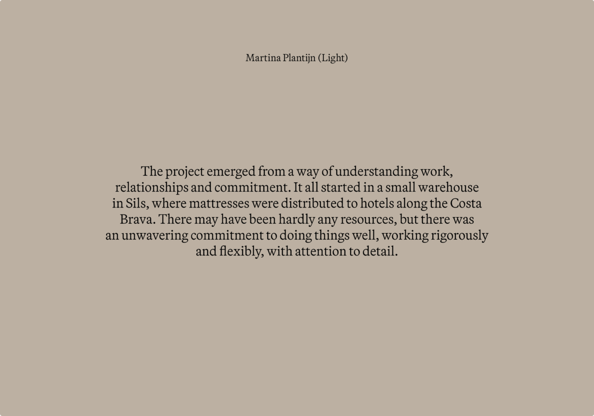
The Kave Haffer, developed together with Displaay Type Foundry, defines the brand’s new typographic character, more coherent and contemporary. To emphasize its human touch, Kave Haffer is complemented by the secondary typeface Martina Plantijn from Klim Type Foundry.
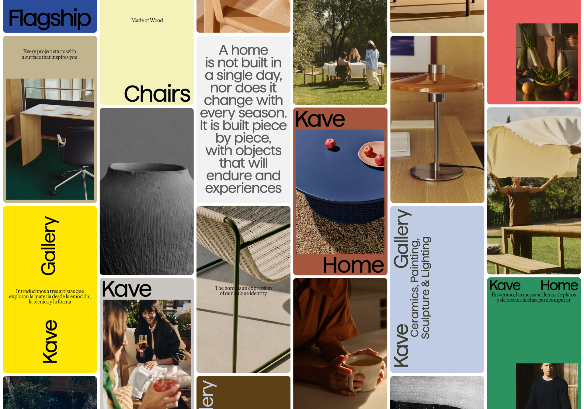
Visual System
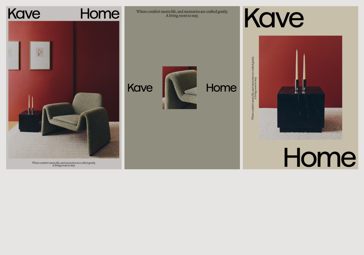
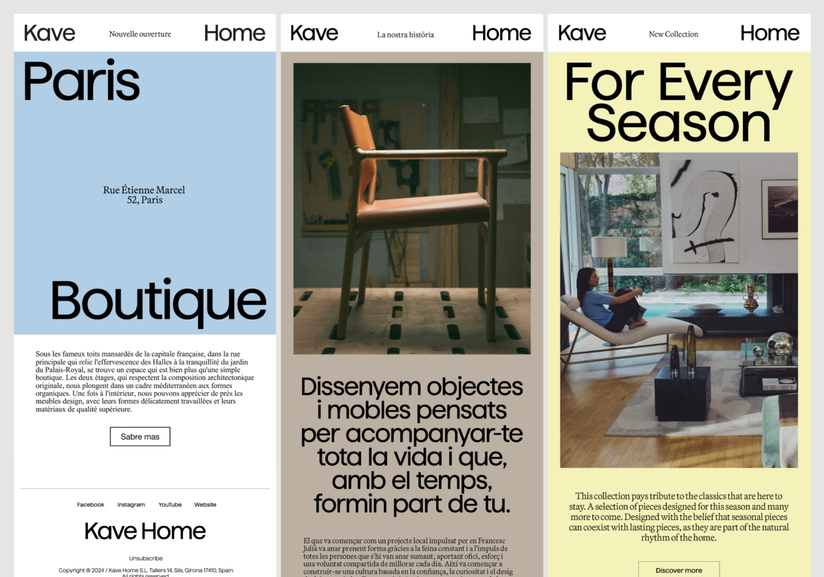
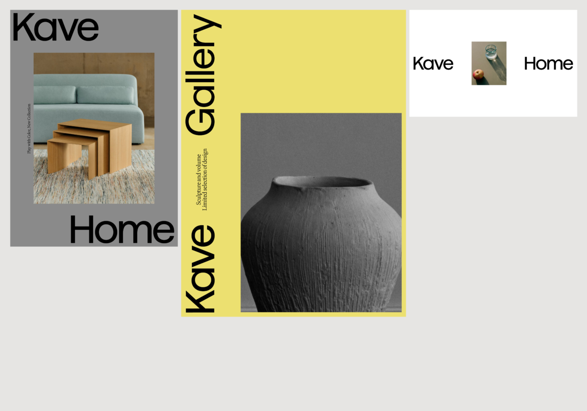
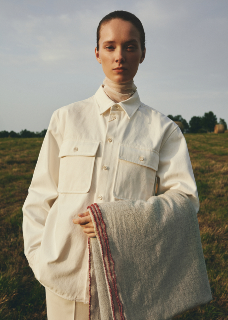
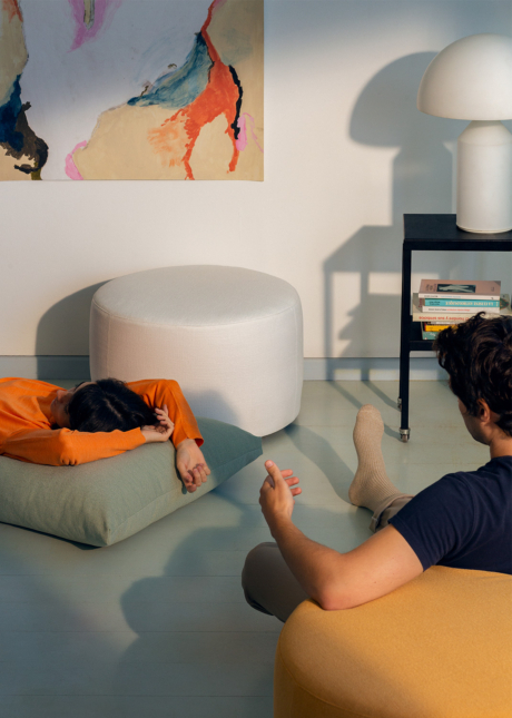
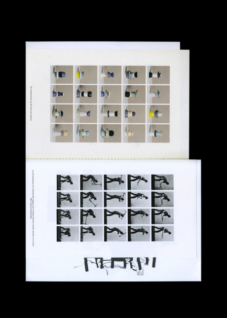
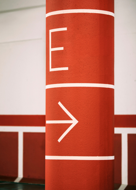
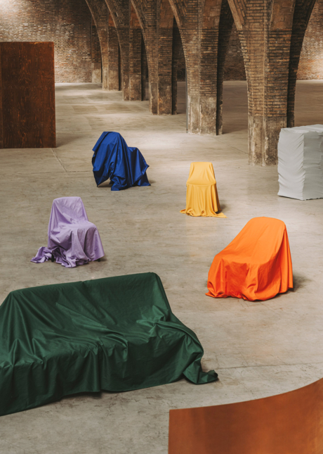
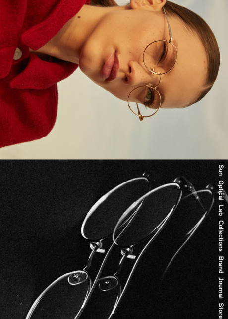
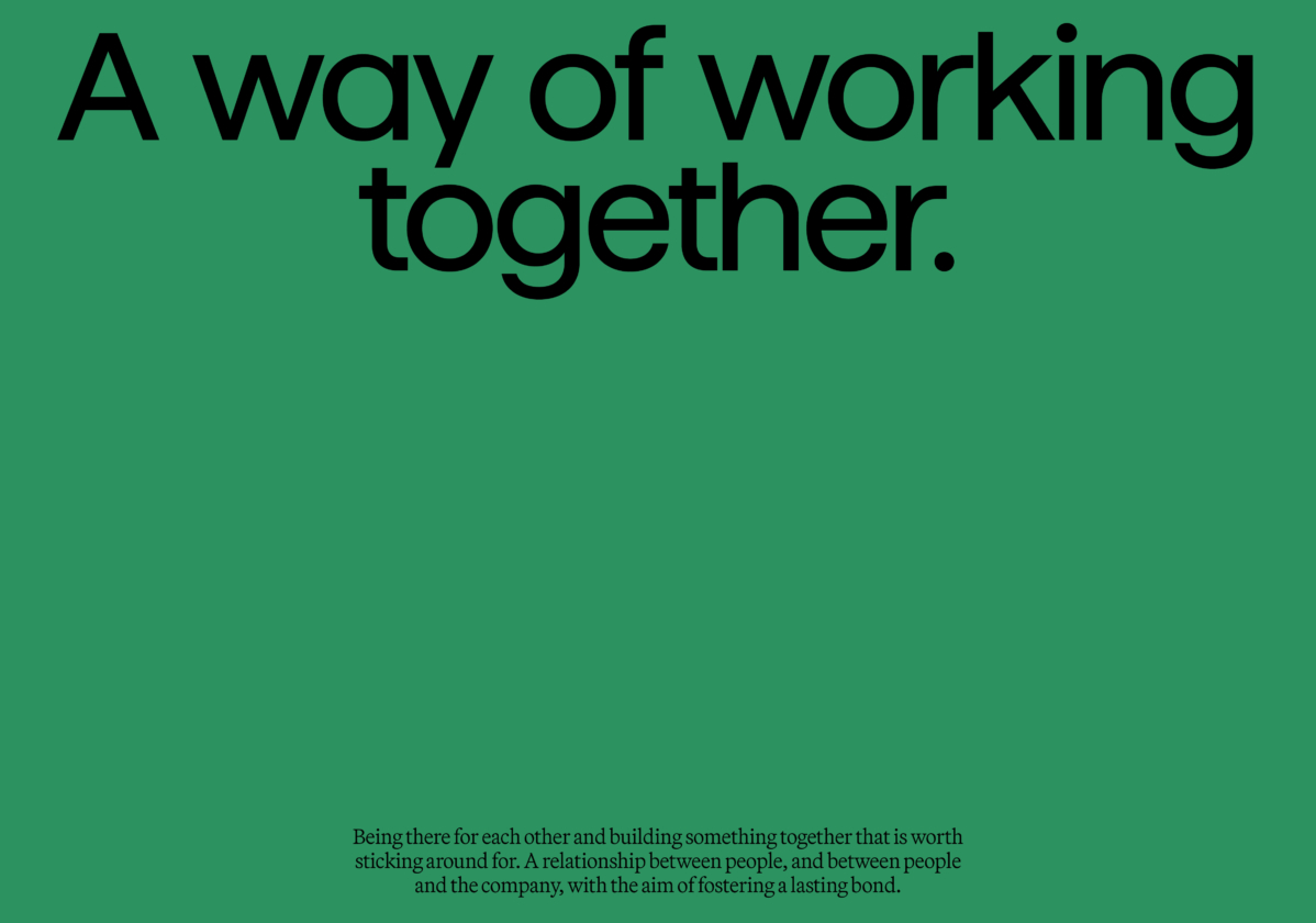
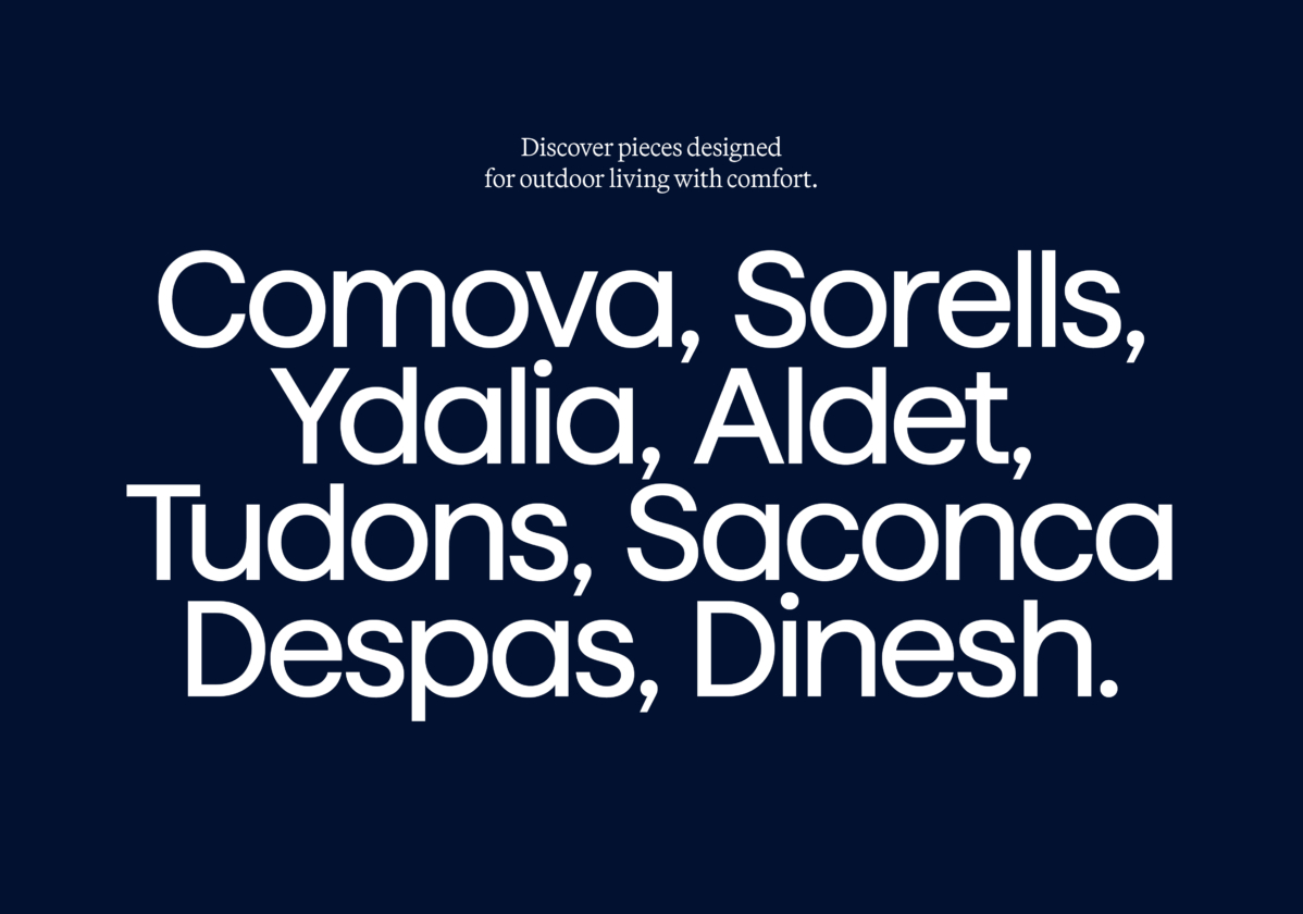
The new visual system combines a dynamic, expandable logo with a refreshed art direction. The aim is to portray products in a more authentic and sensitive way, showing lived-in spaces and capturing the spontaneity of the people who inhabit them. It also introduces a new color palette, inspired by Mediterranean tones but adapted into a fresher, more colorful, and more personalized system according to each communication.