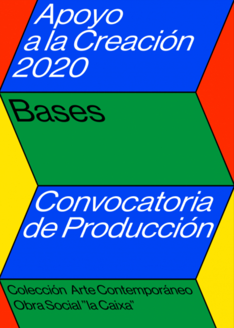
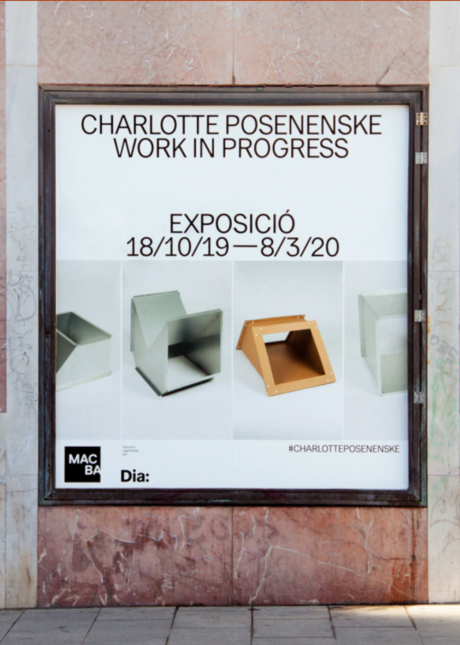
For some years, “la Caixa” Foundation has developed a program to support artistic curation. The expansion of this initiative with an aid to artwork production brought up the need of a specific communication code. We have designed an identity that responds to the requirements of the project: visual power, good digital development and systematization between editions to make the programs recognizable.
Naming & typographic system


Besides restructuring and systematizing the naming treatment of every layer of the Support to Creation programs, we assigned a typographic code to the project. The typographic family Neue Haas Grotesk provides an official, clean tone that reinforces the positioning of the organism that promotes it, “la Caixa” Foundation.
Graphic system
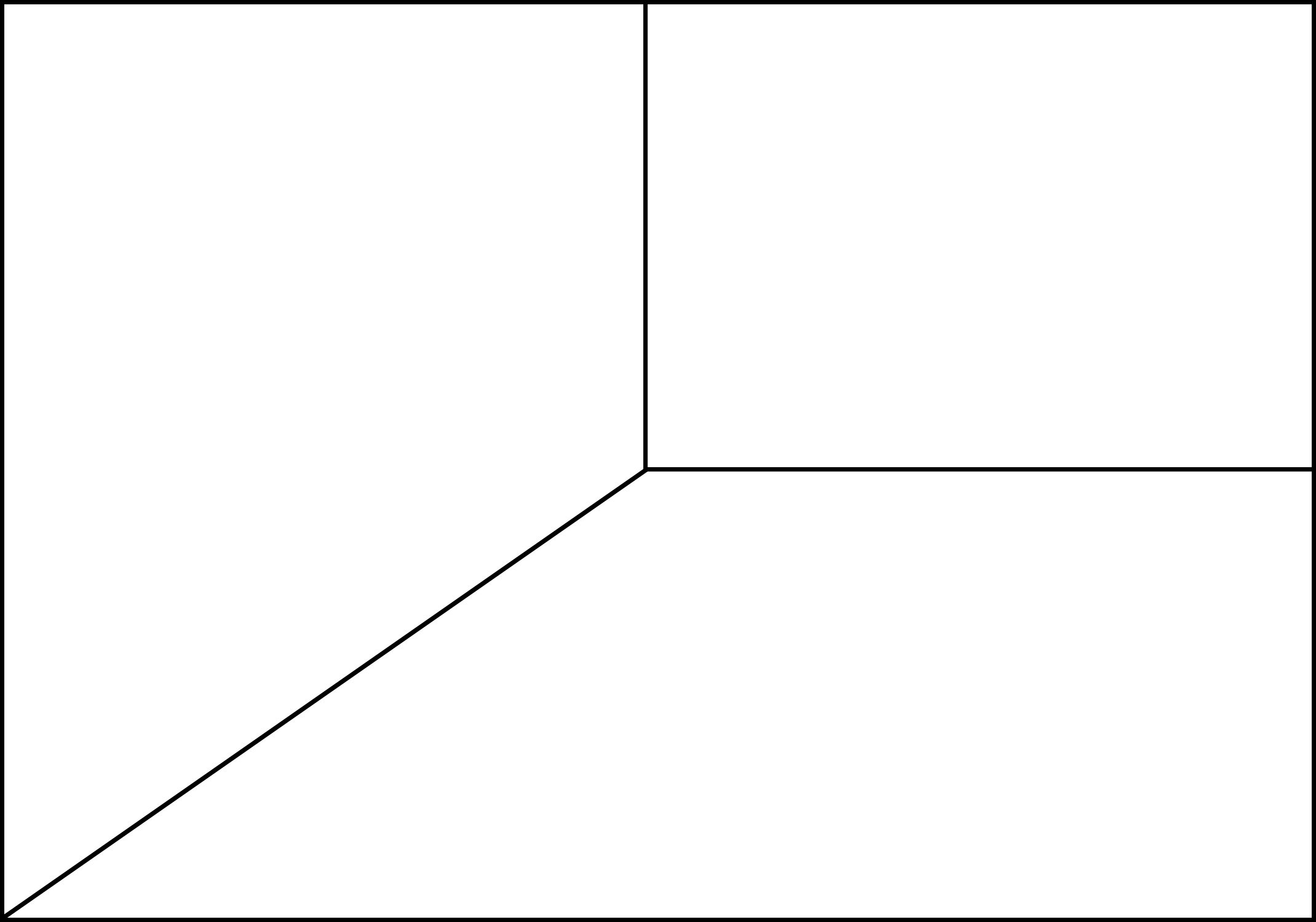
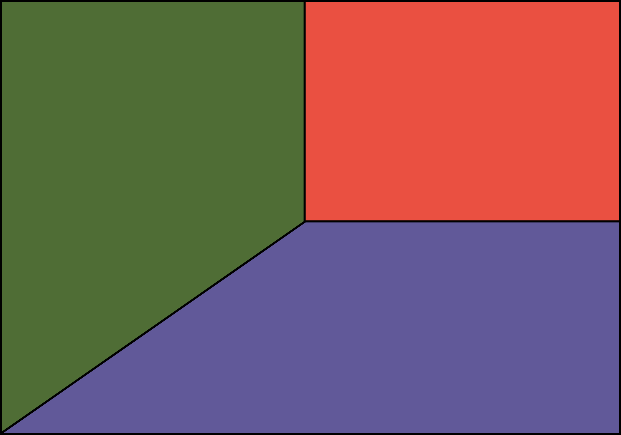
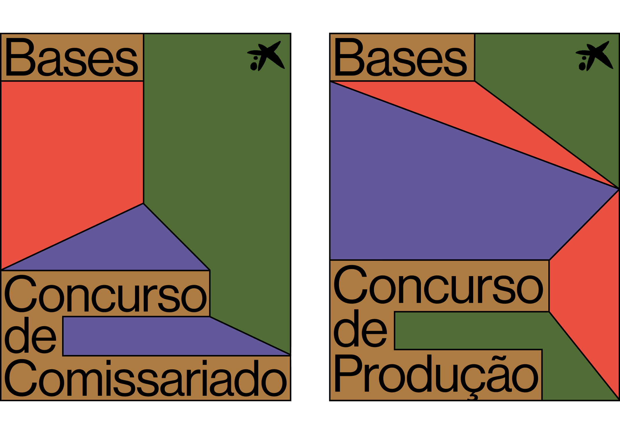
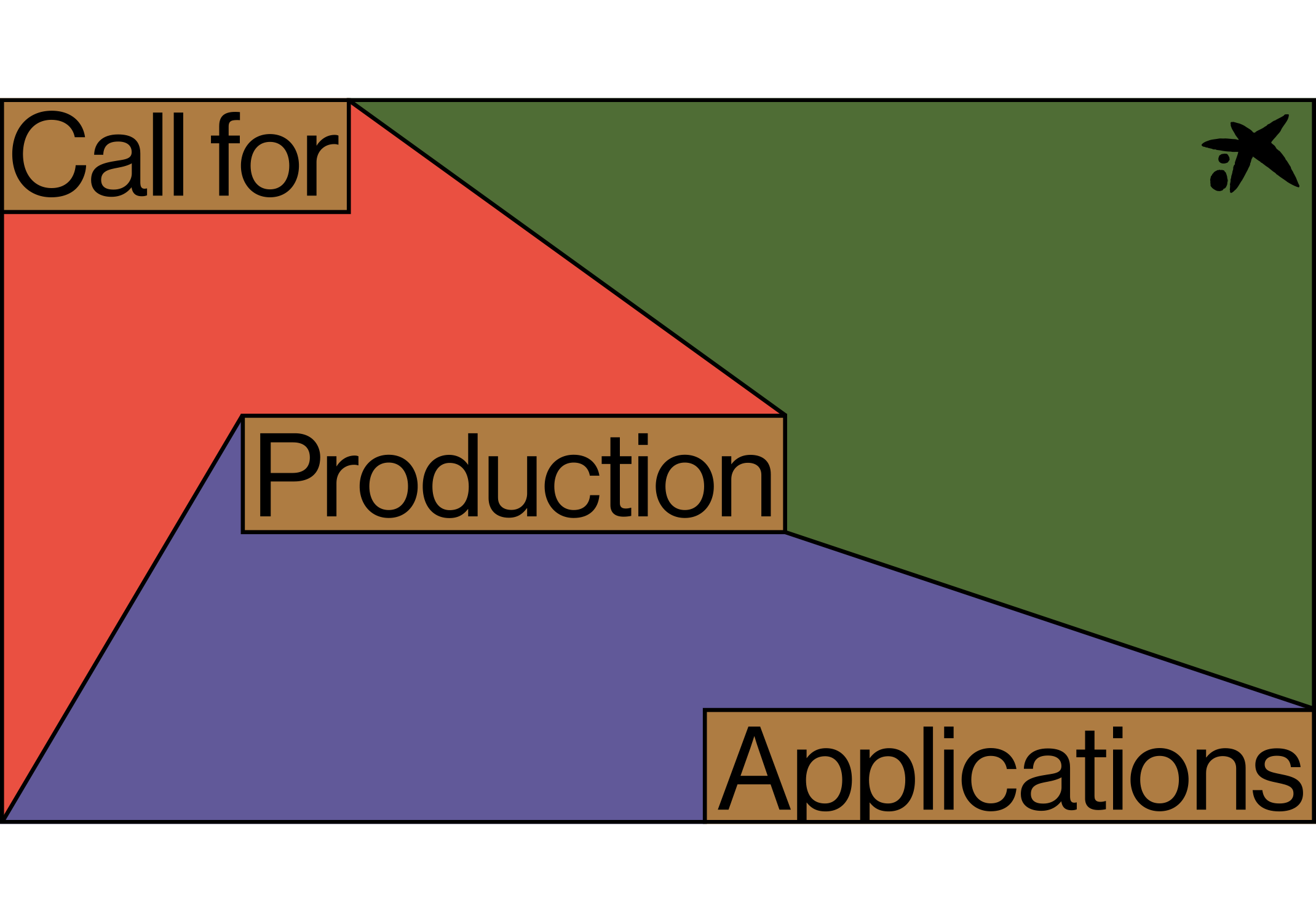

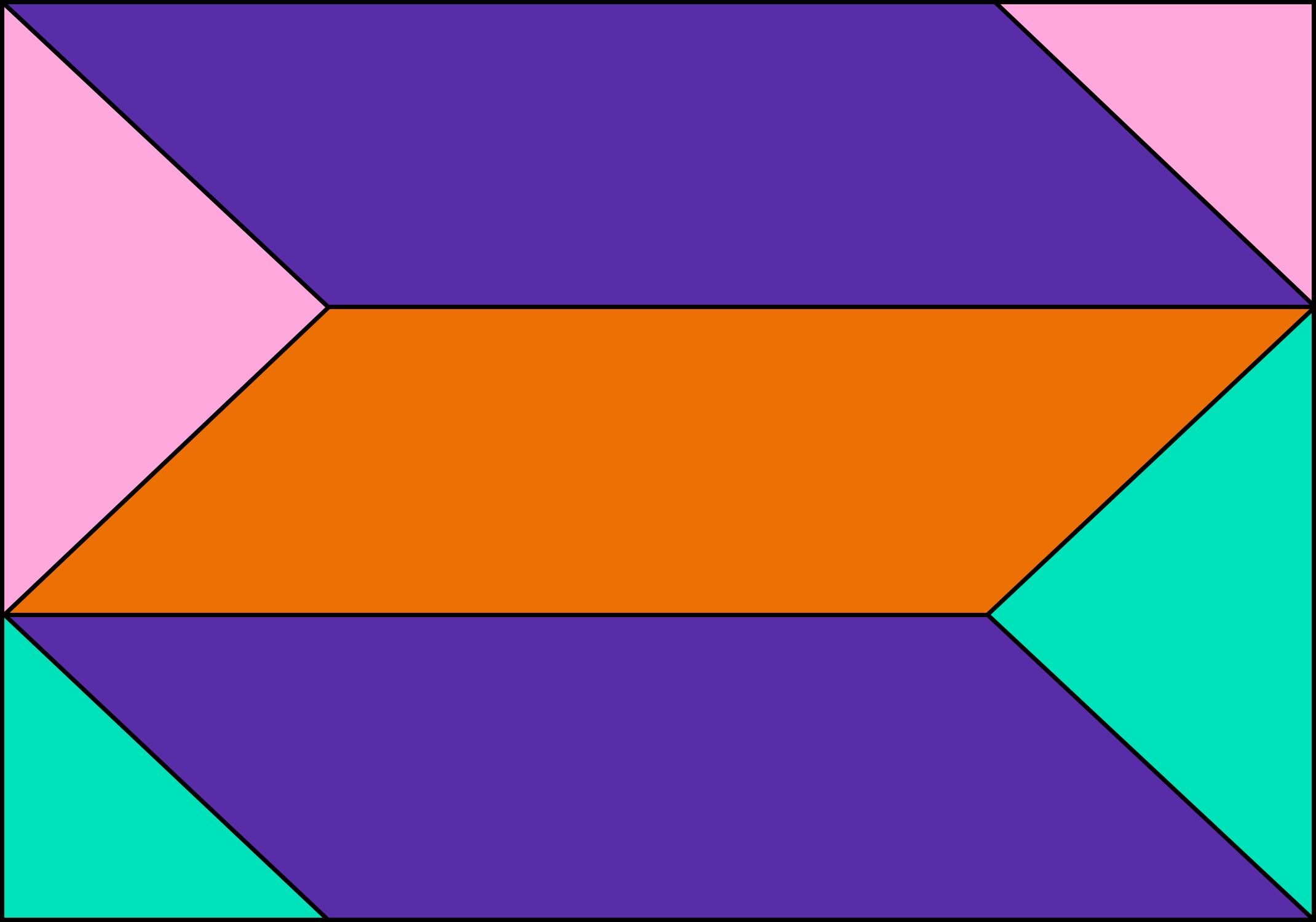
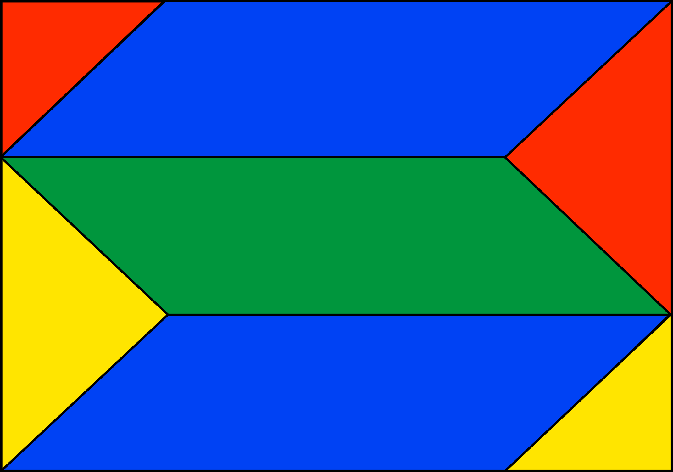
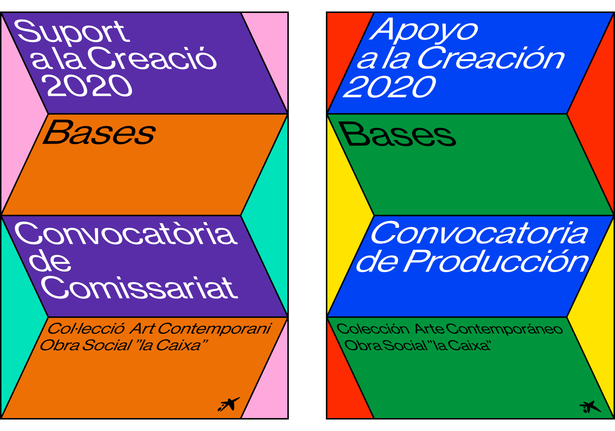

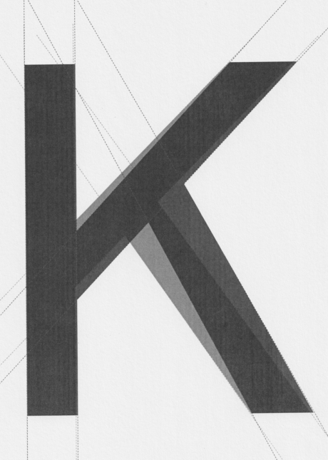
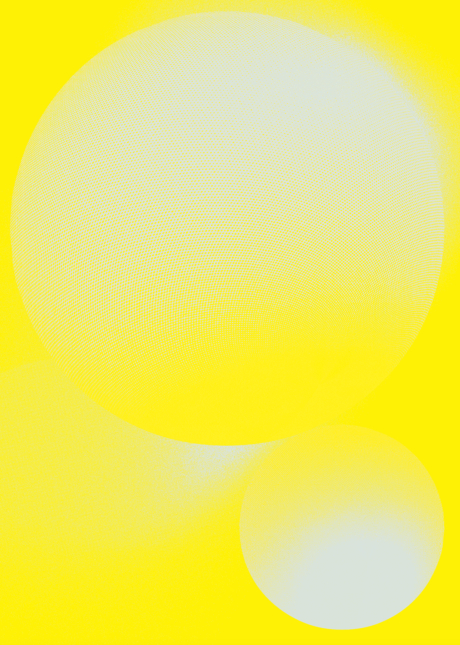
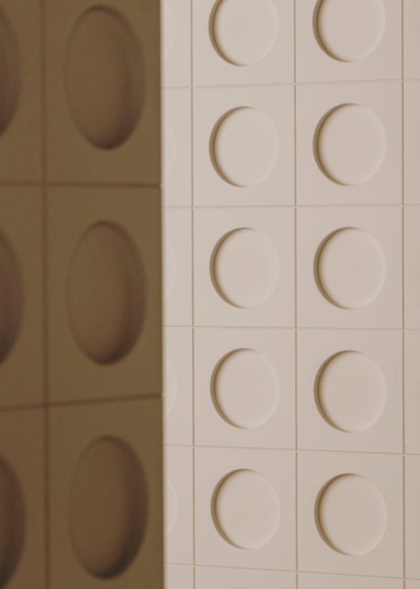
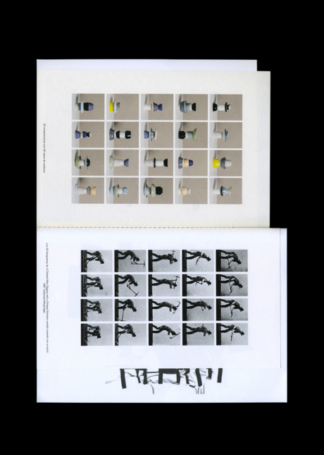
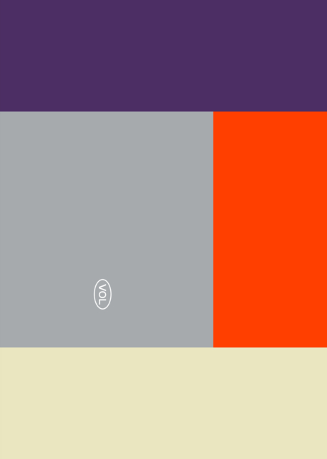
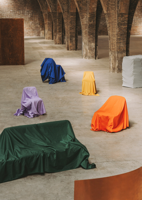
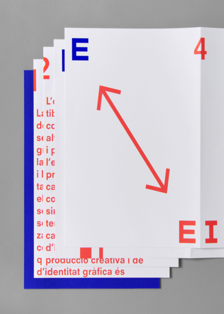
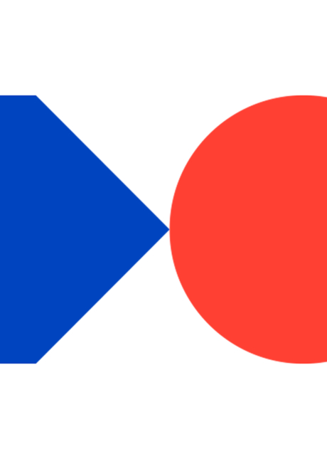
The basis of the graphic system is the optical effect generated by the tension between the empty space and the volume. We conceptually contrast the two areas of the program: the exhibition space —where the curation works— with the volume of the artwork —which requires production—. The graphics evolve slightly both compositionally and chromatically in each edition, making the change visible while maintaining the global identity.
Animation
For the last edition we worked with Gimmewings Studio to develop the animation. Movement reinforces the optical effect and multiplies its power in the digital realm. The color scheme is also designed to attract attention in a feed where every day is more difficult to stand out.