


Universitat Pompeu Fabra is one of Spain’s highly-ranked universities on an international level, widely known for its excellence and Humanistic background. We approached this rebranding project by recovering, with a contemporary attitude, the cultural meaning and importance of the personality behind the institution’s name.
Brand identity
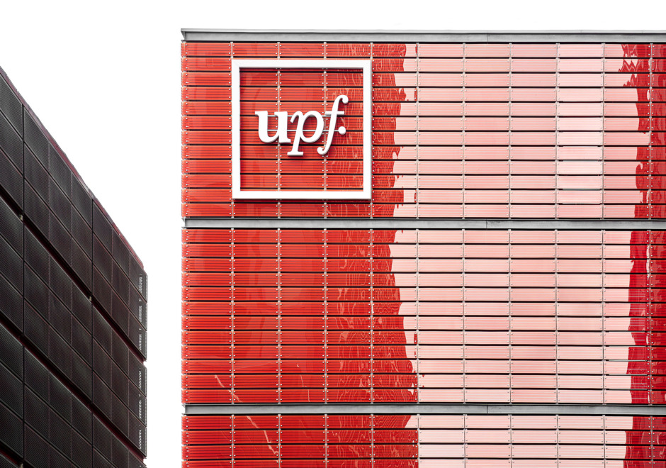
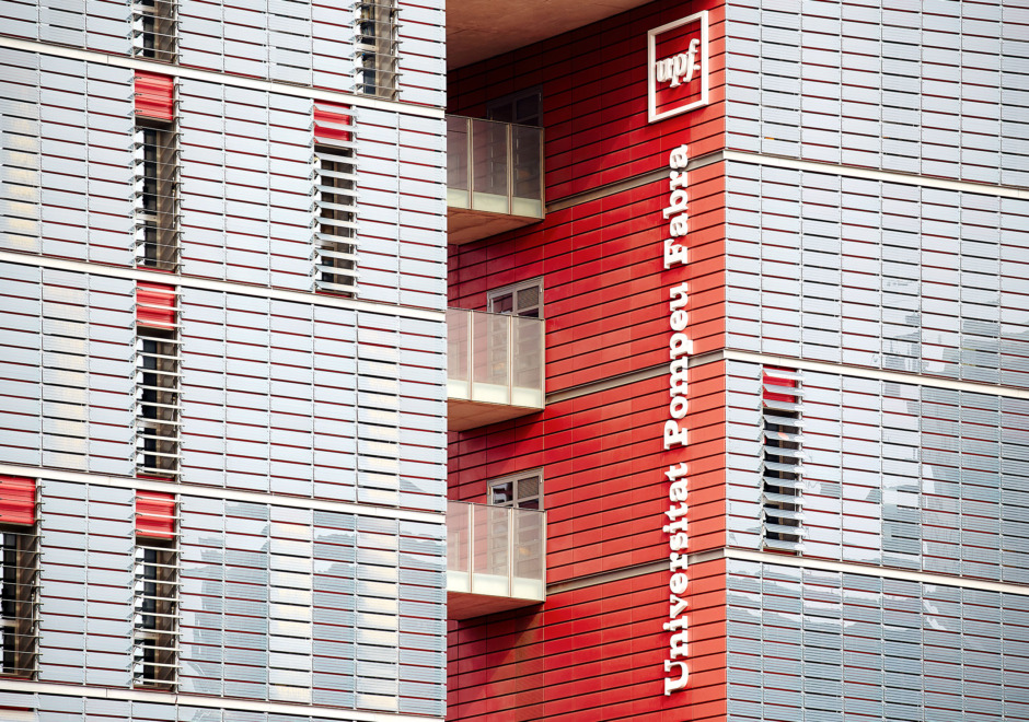
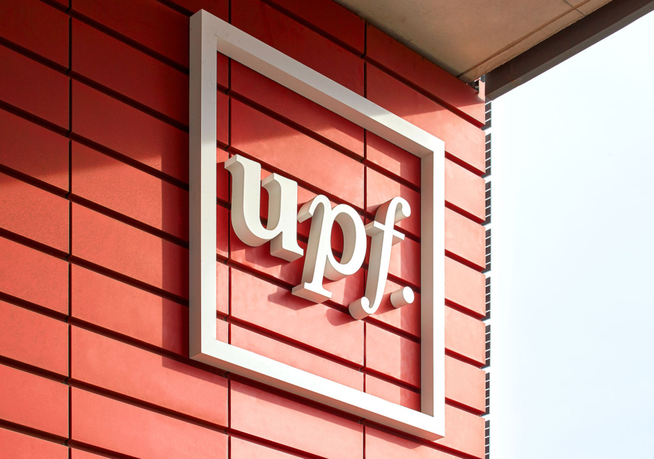
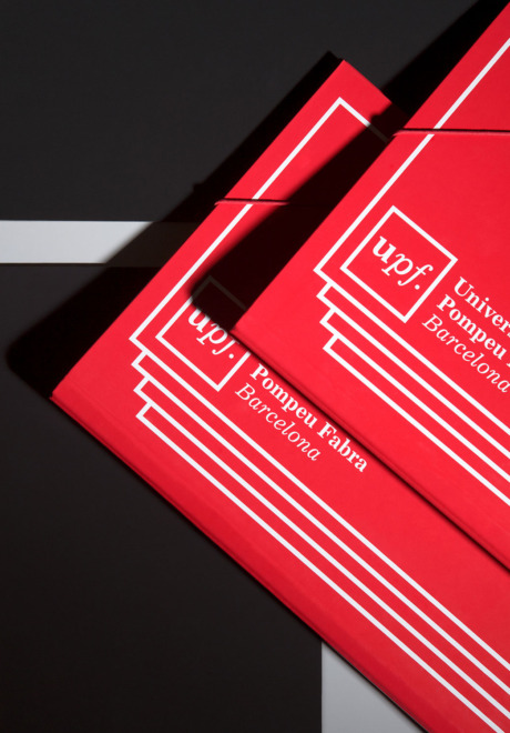
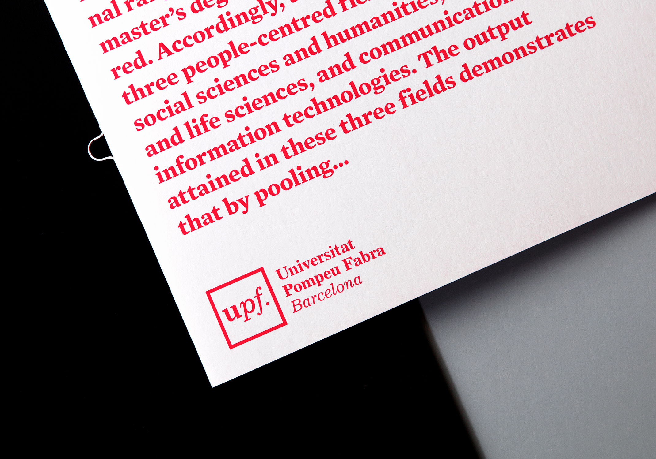
Pompeu Fabra is credited as the main author of the normative reform of contemporary Catalan language. The logotype consists of an UPF acronym set in the universal typographical criteria used in the Dictionary. Excelsior serif-typeface was used to emphasise the university’s humanistic and solid character, and the red frame that surrounds it ends the construction of the symbol. In it, we gathered the main graphic codes of the brand identity.
Visual Language
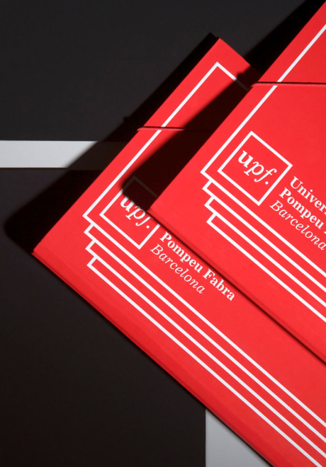
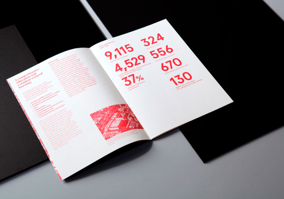
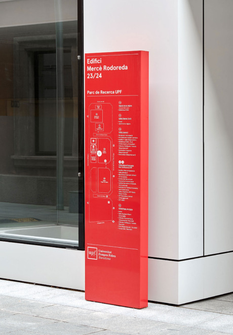
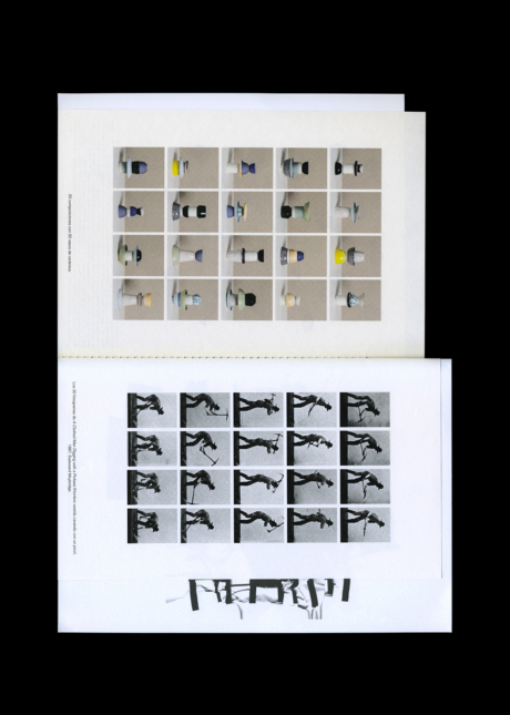
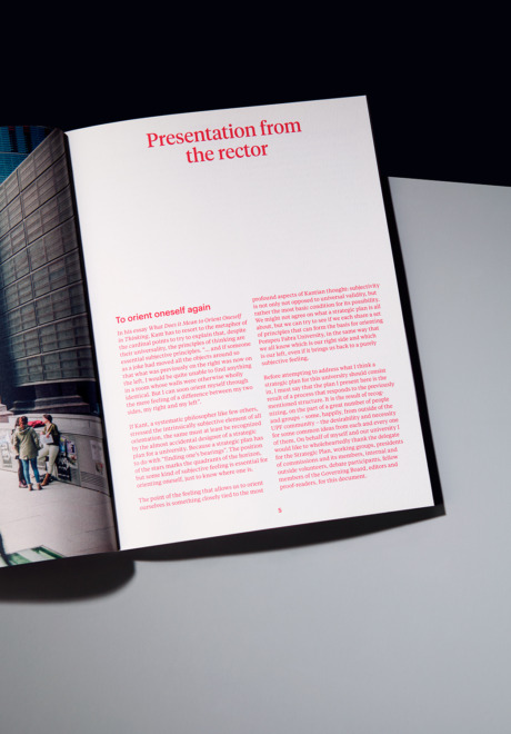
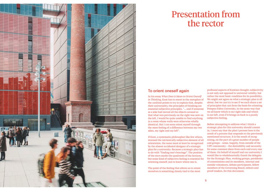
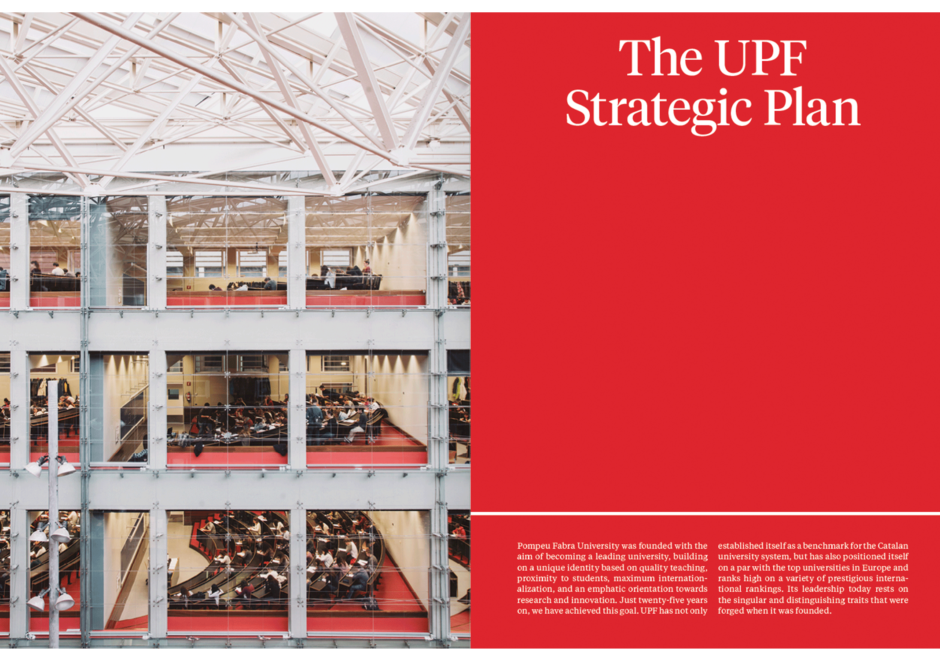
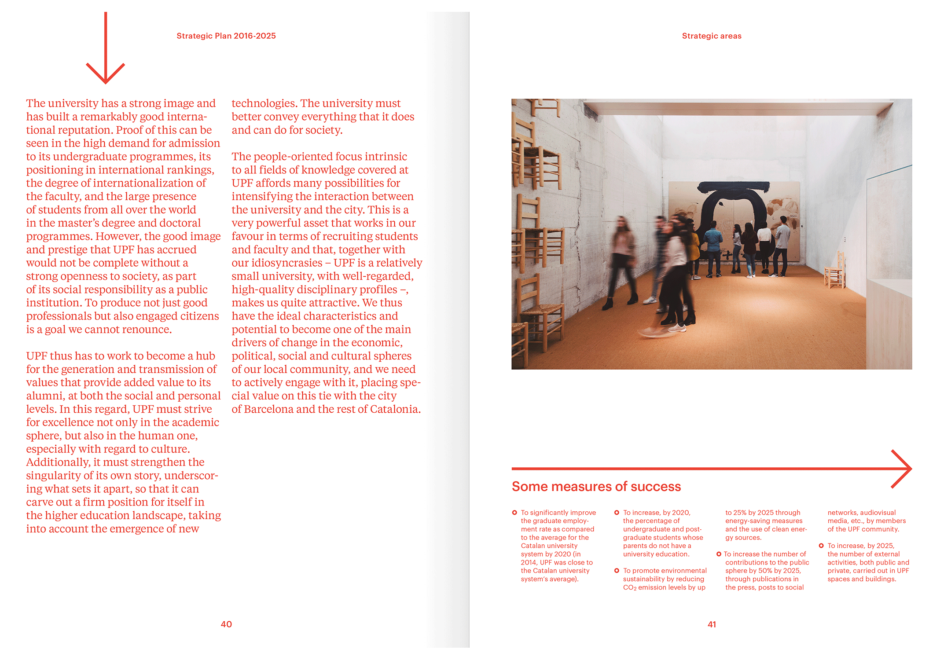
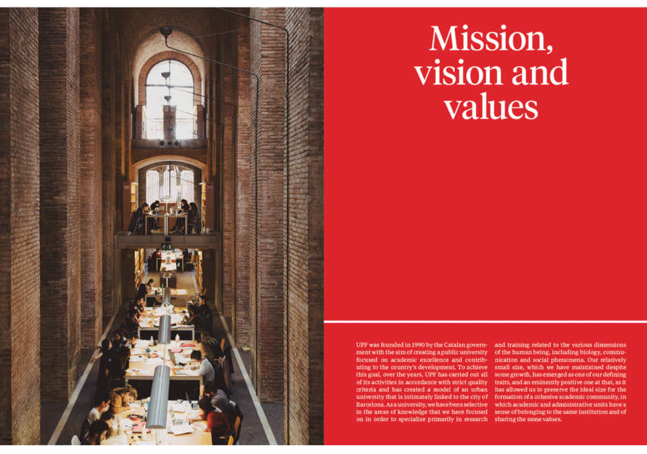
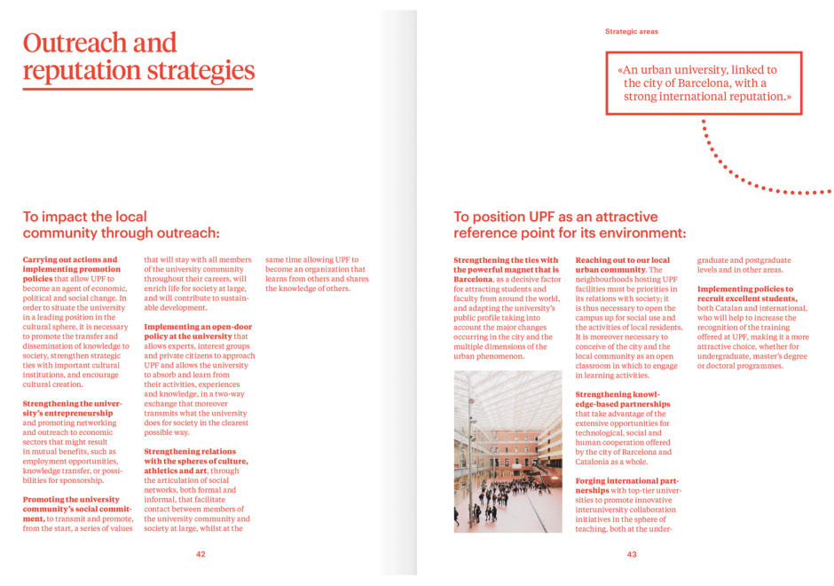
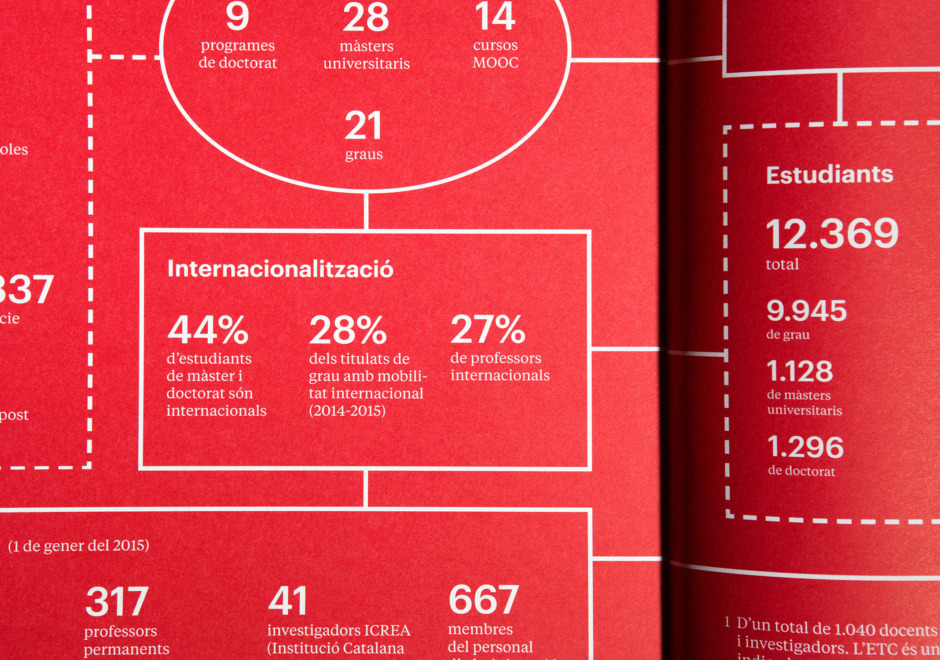
Squares that contain information link to the idea of the university as a knowledge container; a language of analytical nature evokes the institution’s prestigious scientific community. These were the fundamental elements we defined for UPF’s corporate identity. In the “2015-2016 Strategic Plan” corporate book, we condensed the university’s graphic universe, adding Salva López photography to give the piece a human character.
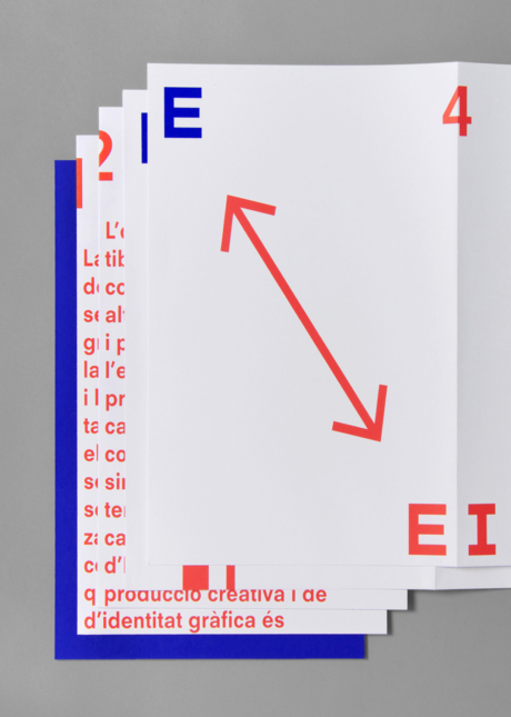
Publication
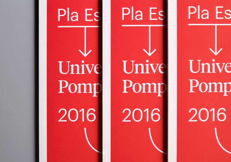
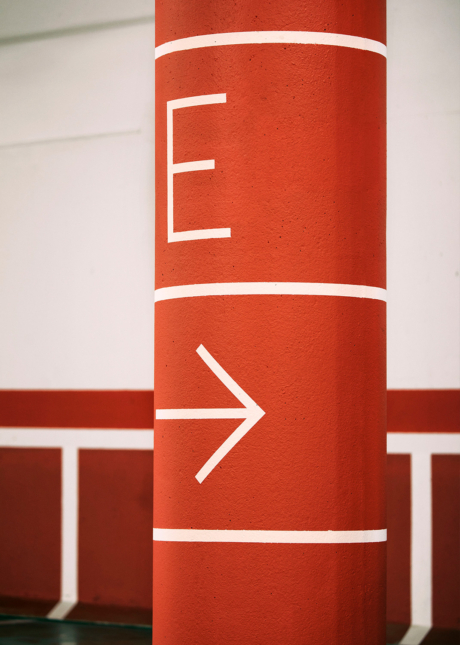
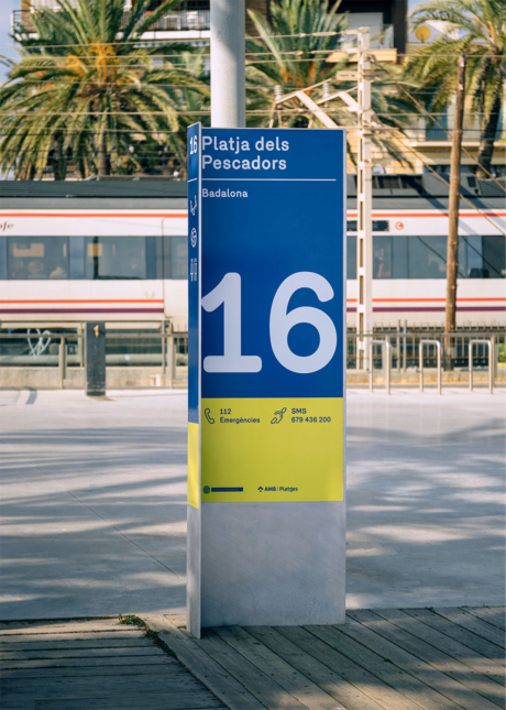
Signage