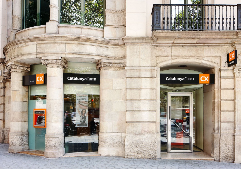


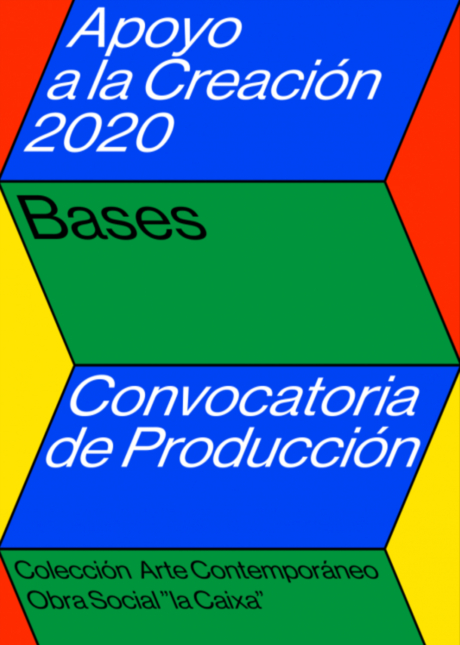


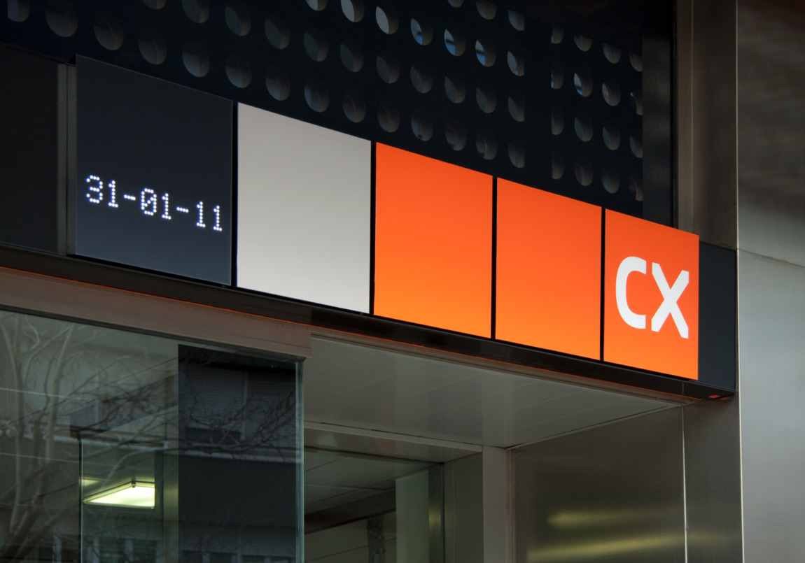
CatalunyaCaixa was the result of the fusion of three of the biggest savings institutions in Catalonia in 2010. The brand strategy focuses, firstly, on the name, which is not only a trade denomination, but rather also forms part of the collective imagination of our country. In keeping with this concept, we designed a subdued, balanced and compelling brand identity that generates trust and credibility.
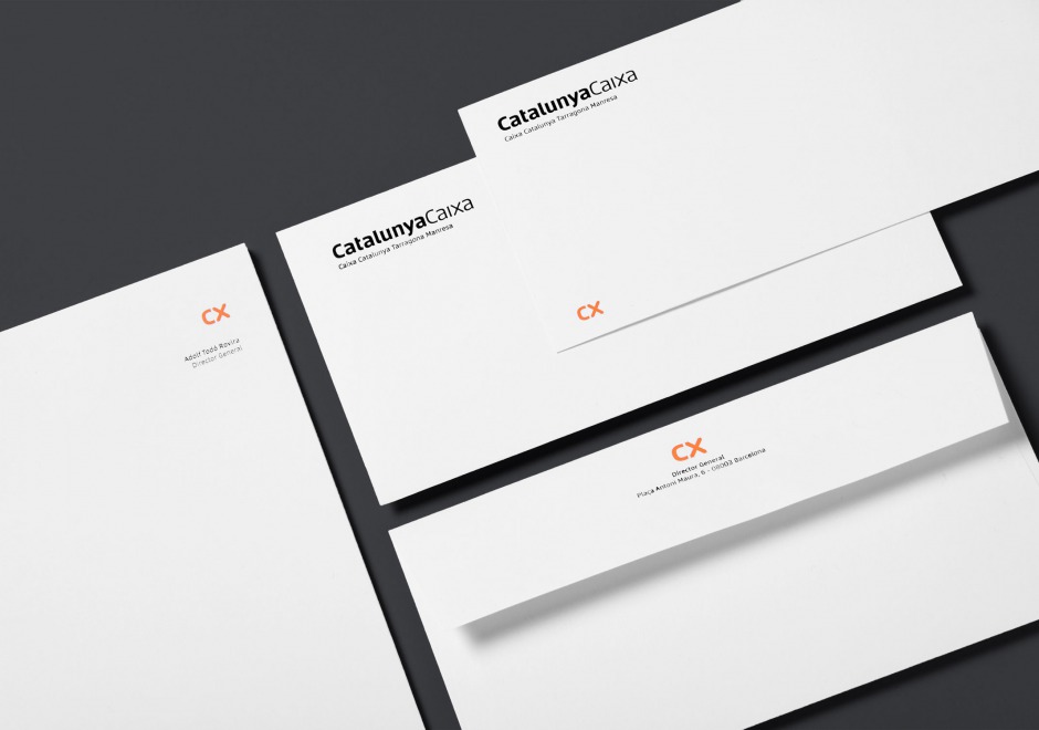
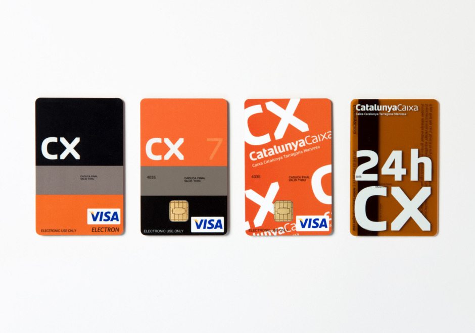
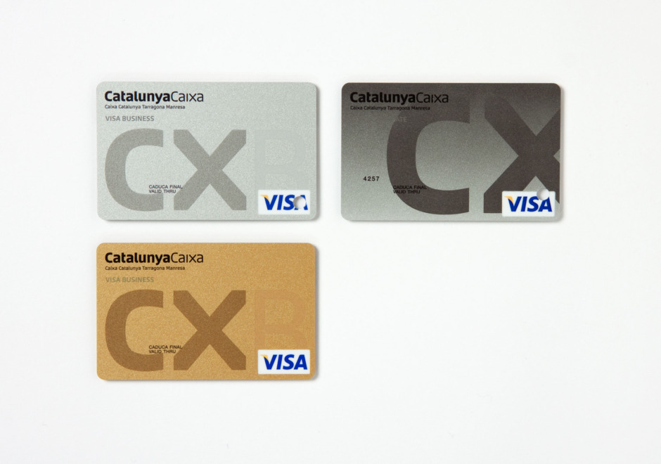
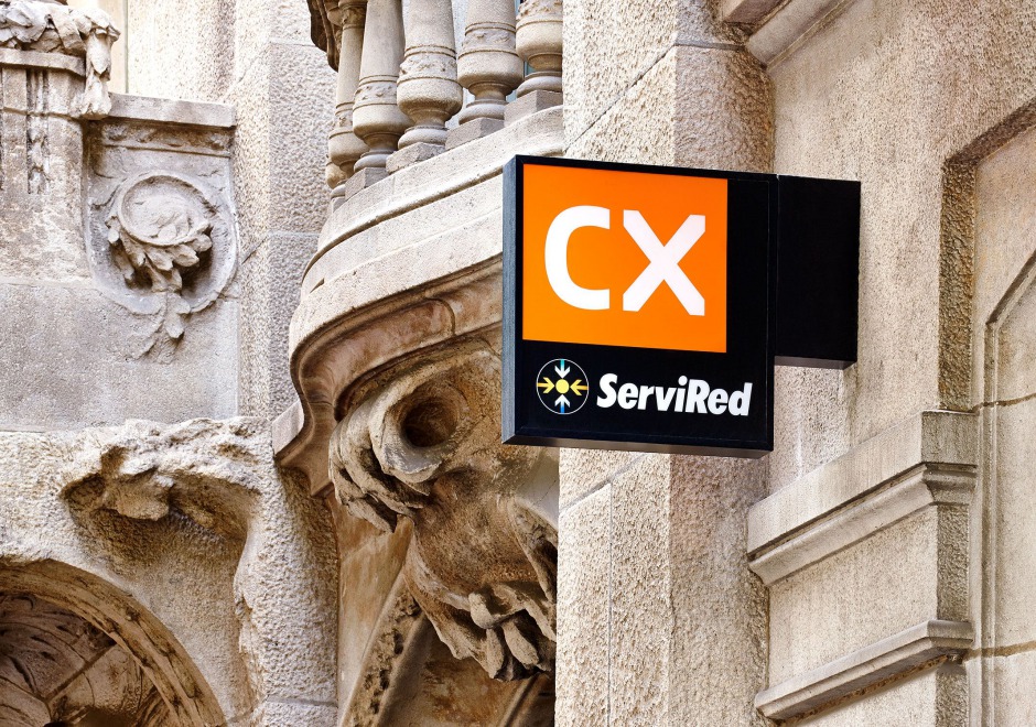
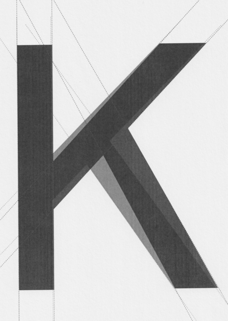
We asked Íñigo Jerez to develop a personalised and exclusive font type, the CX font, which along with a tri-colour code, provides a distinctive and characteristic identity that is used to identify everything from the façades to any other communication element of the institution. The initials CX, a contracted form of “Caixa”, serve as an identifying symbol/signature while at the same imbuing the brand with a contemporary air. The same graphic criteria were applied for the development of the identity of the sub-brands of Obra Social and subsidiary companies of the brand architecture defined.