


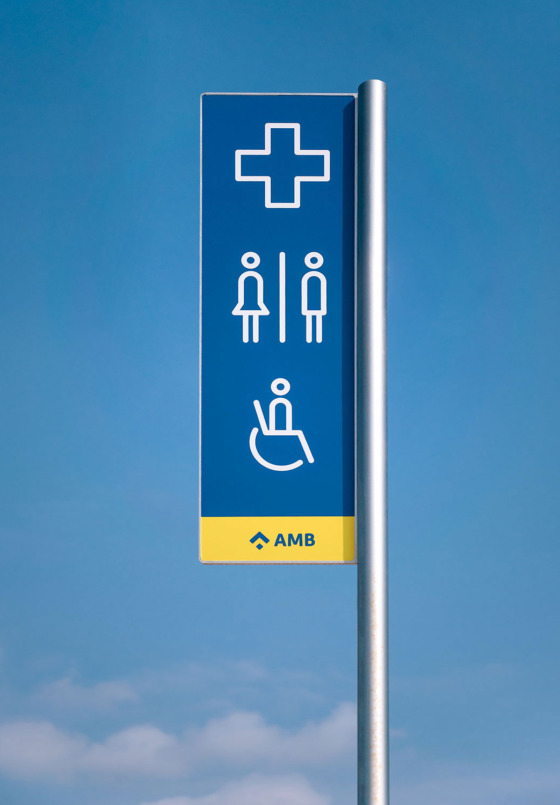
AMB is the public administration of the metropolitan territory of Barcelona, and the institution in charge of the growth and connection of urban systems around the city. We created a unified signage system that involved the design of four identities for public spaces: Parks, Beaches, the Llobregat River trail and the Bike Routes. They all share a friendly monolinear style, seen across the typefaces and pictograms, and modular L-shaped information displays. In Parks, Beaches and Bike signage projects we collaborated with the industrial design studio Salva Fàbregas.
Graphic language


The graphic language answers to two basic needs: To be close to the user and to maintain coherence between the different identities. Thanks to the style analogy established between pictograms and typography and a bold use of color, the recognition and the proximity with the audience is guaranteed.
Parks signage
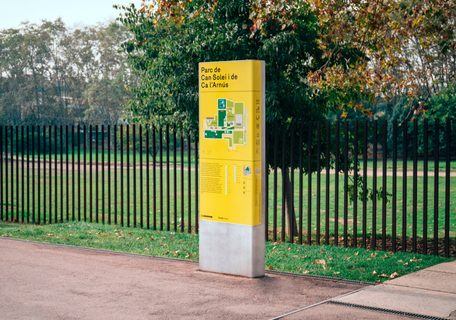
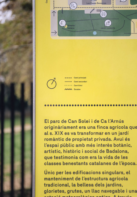
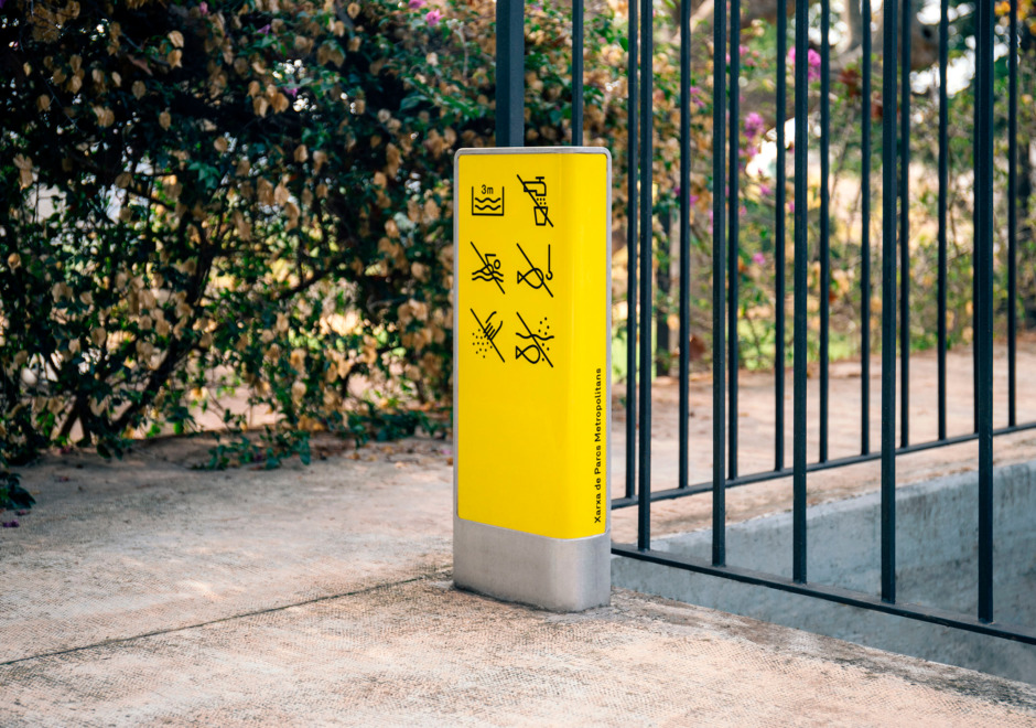
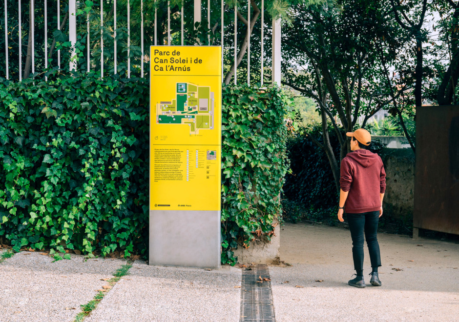
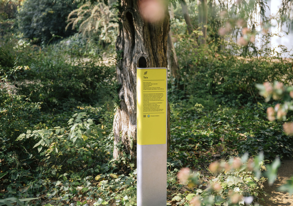
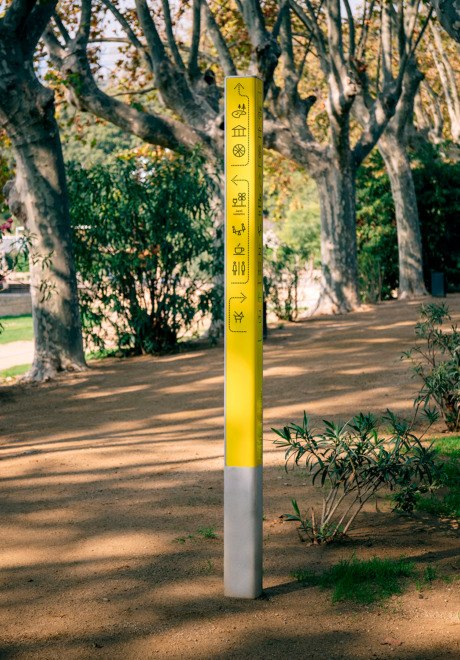
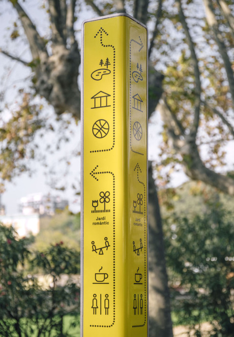
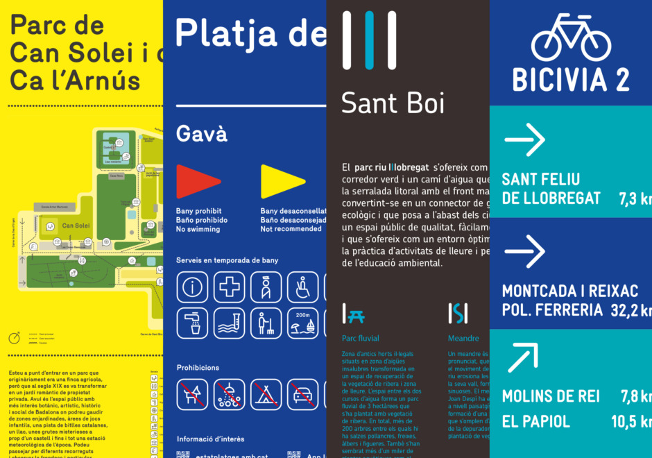
We modernised the image of Barcelona’s Parks by making a visual identity of infographic style that, in its striking yellow colour, popped out from the green surroundings. FF Netto typeface was our basis to design a broad family of pictograms and to build a whole communication system. The Parks’ signage includes a tall wayfinding signage column; a main entrance marker with a simplified map of the landscape; and other specific signs that spot the existent fauna and flora.
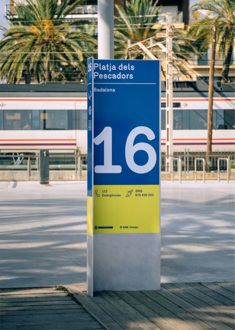
Beaches signage
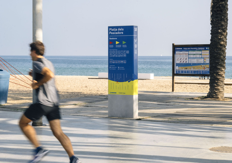
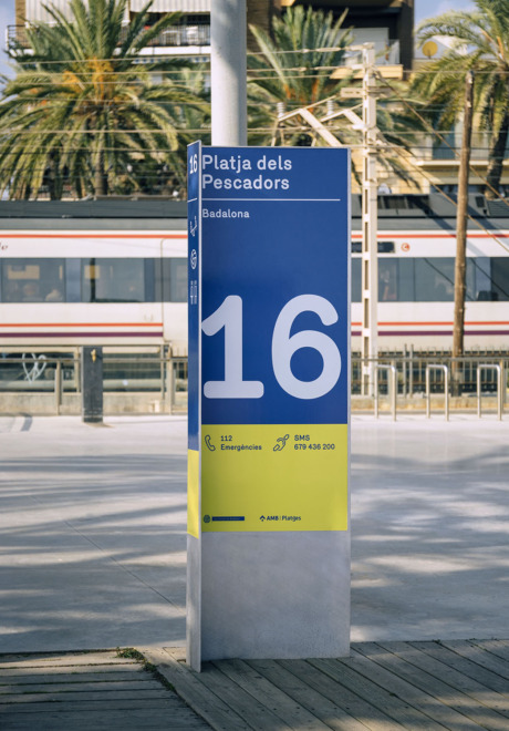
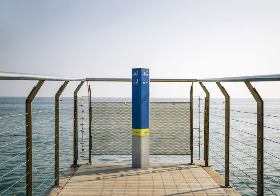
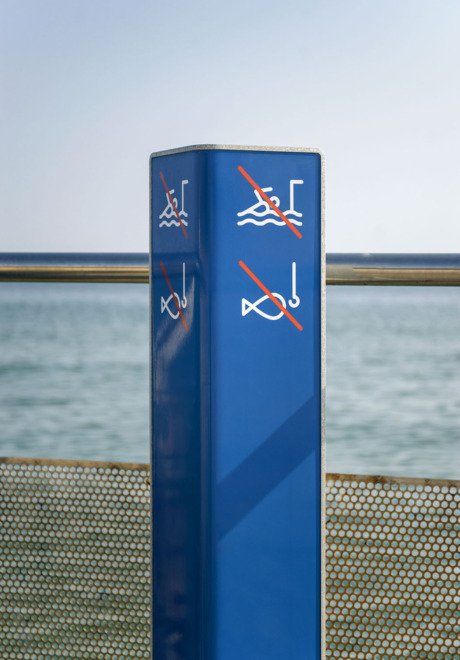
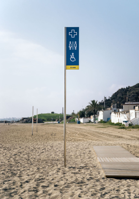
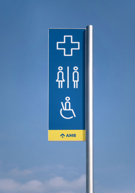
Our update of Barcelona’s beaches signage, originally designed by Claret Serrahima, aimed to unify AMB’s overall communication. This meant to retouch colour tones, apply the new family of pictograms and implement the L-shape block system. We also adapted the signage design to other space-specific communication supports, like the iconic flags that stand throughout the whole sea coast of Barcelona.
Bicivia signage
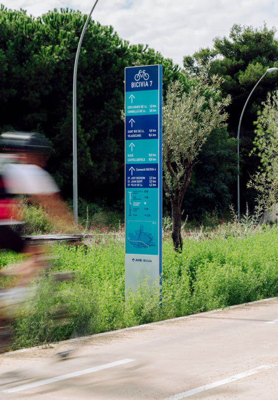
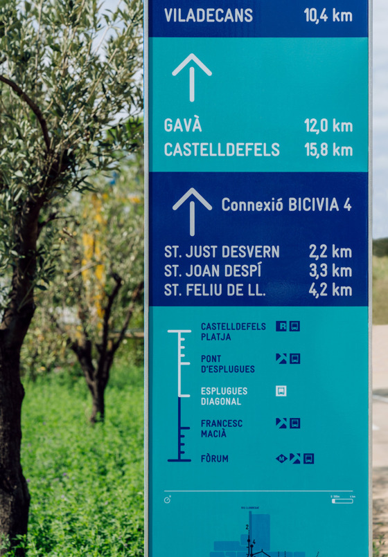
The Metropolitan Area bike routes network needed a common signage design. Following the idea of accompanying the cyclist in every spot, we designed a system that makes the route easy to identify besides clearly defining the path of it. Using color stripes to organize the information and designing a distinctive typography treatment, we give a strong identity to every piece, linking them between each other and with the other AMB signage elements. We worked with Xavier Grau to create the naming.
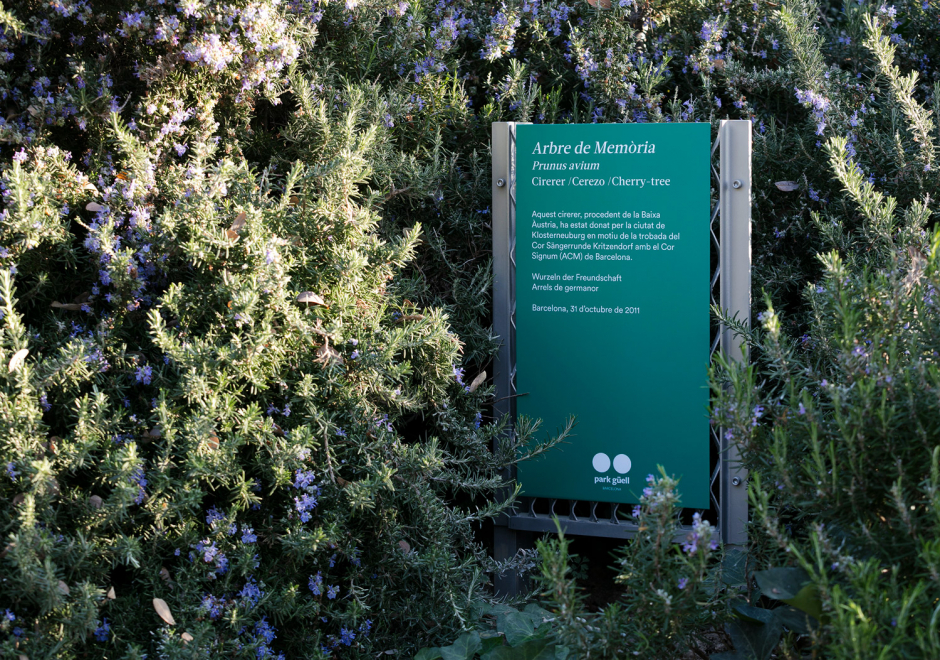
Llobregat River signage
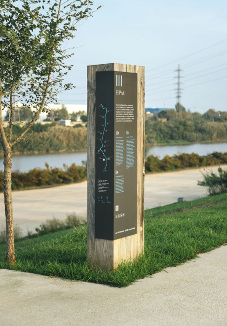
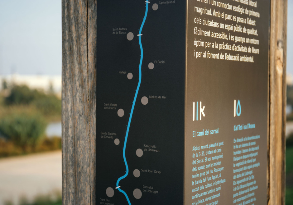
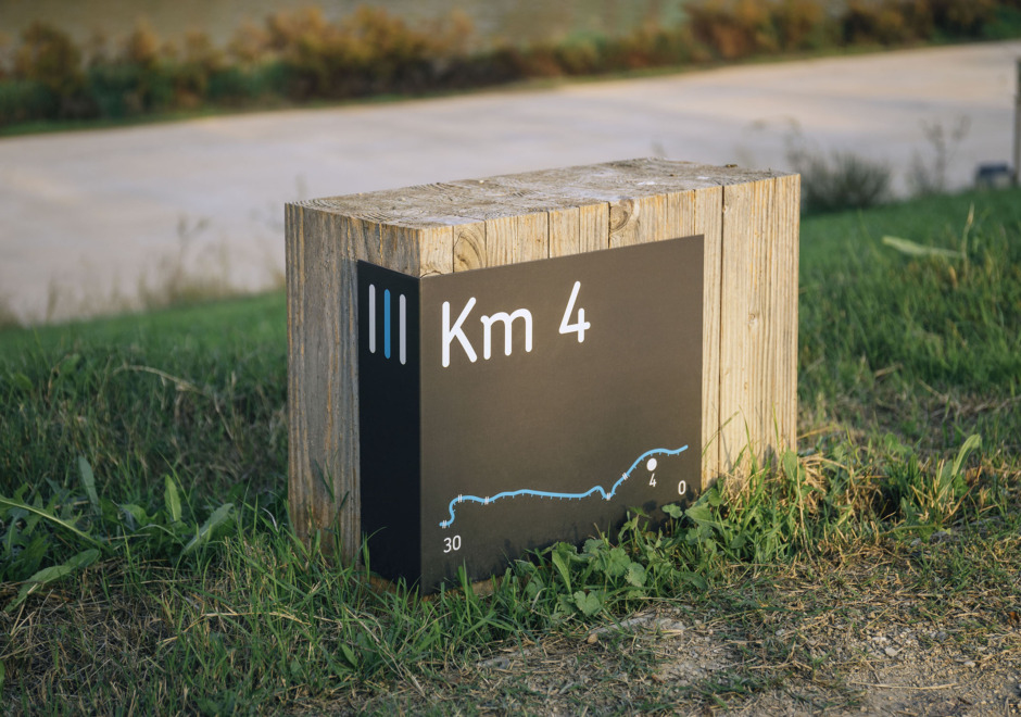
Llobregat river shores make a 30 km long Park that goes across sixteen municipalities of Barcelona. We created a monolinear visual identity out of the double “L” in the river’s name, a feature that we extended to the design of maps and pictograms. The signage system is made of wooden blocks and easy-maintenance metallic boards to overcome the durability and to be integrated without violence between the riparian vegetation and hurdles. It includes large signs to pinpoint areas across the river, and smaller ones that work both as distance markers and benches.