


Visual identity and communication system for Prostoria, a contemporary furniture company based in Croatia. Rooted in local craftsmanship and advanced manufacturing, Prostoria blends collaboration, innovation and a strong Central European design heritage, expanding it into a clear, global and culture-led brand presence.
Creative Direction: @altherrdesilepark
Graphic Design: @clasebcn
Graphic System
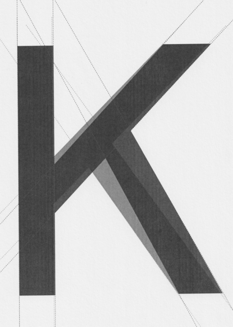
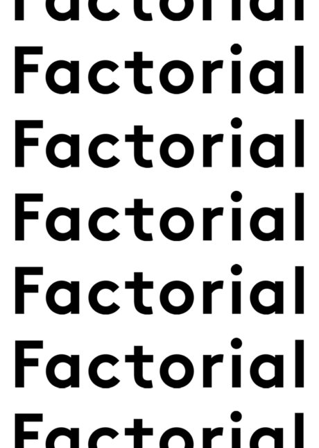
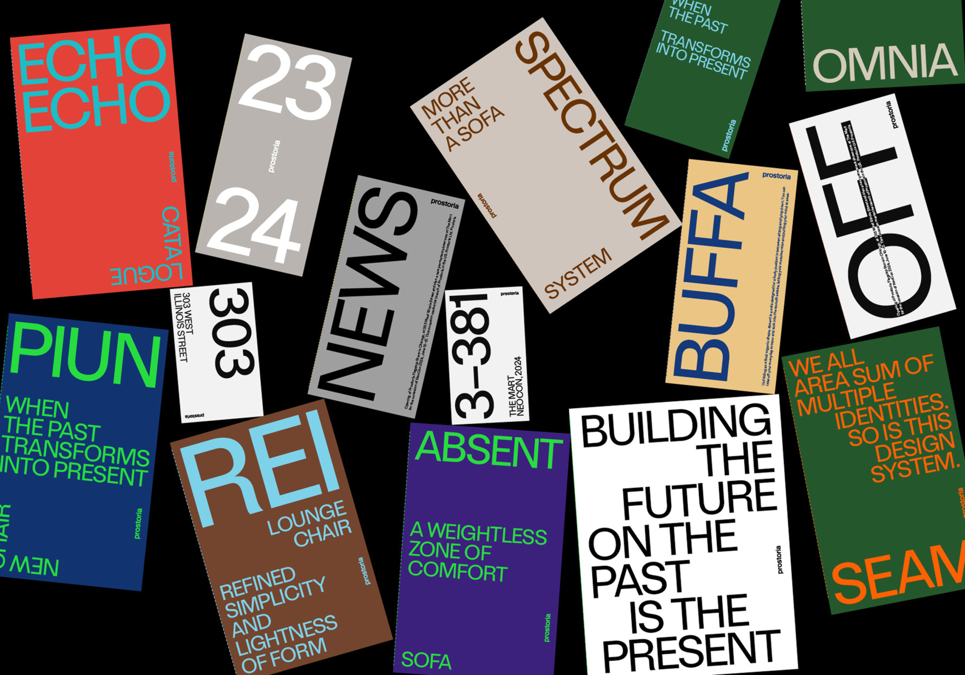
Keeping the existing logotype, a bold constructivist graphic system was developed to express Prostoria’s values and product vision. The language draws from Croatian modernism while pushing towards a contemporary, international perspective, with a strong connection to art and design culture. Typography, composition and colour work as an adaptable system across brand communication, editorial and digital contexts.
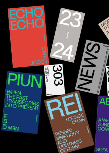
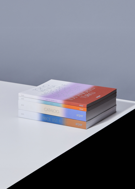
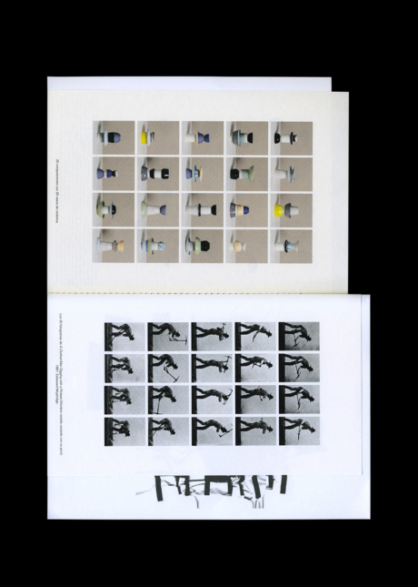
Catalogues
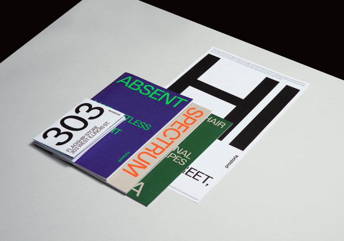
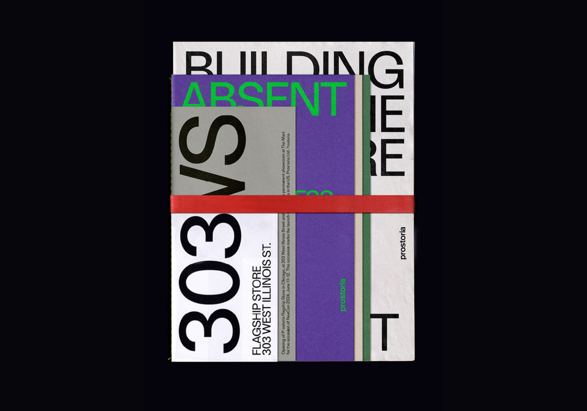
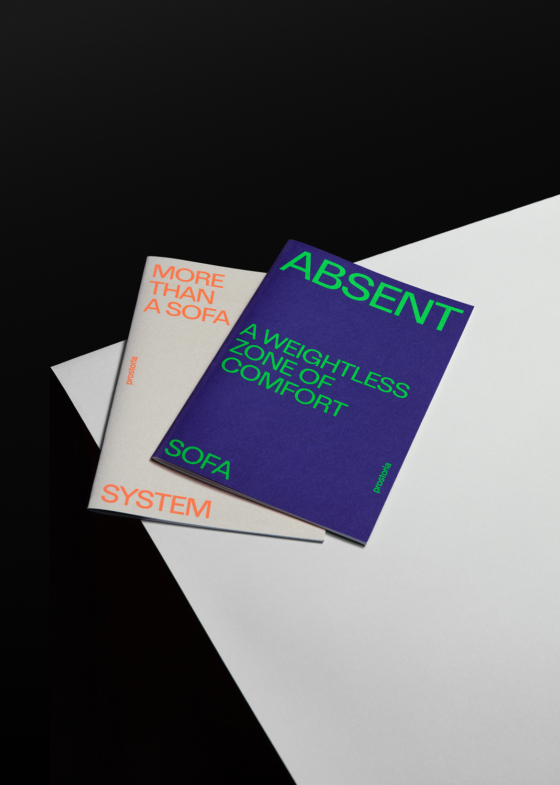
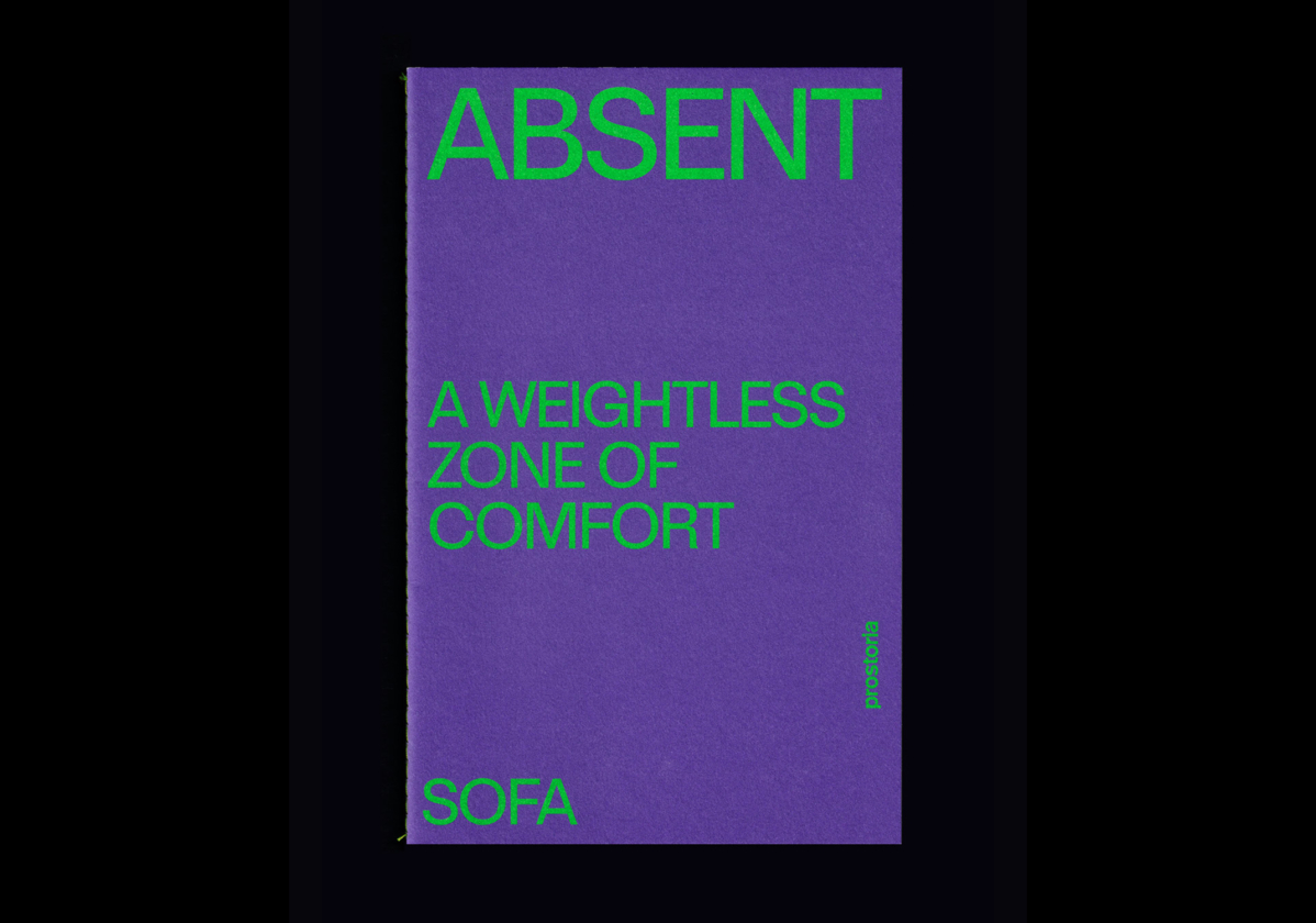
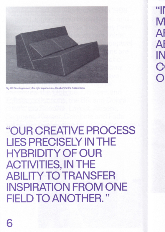
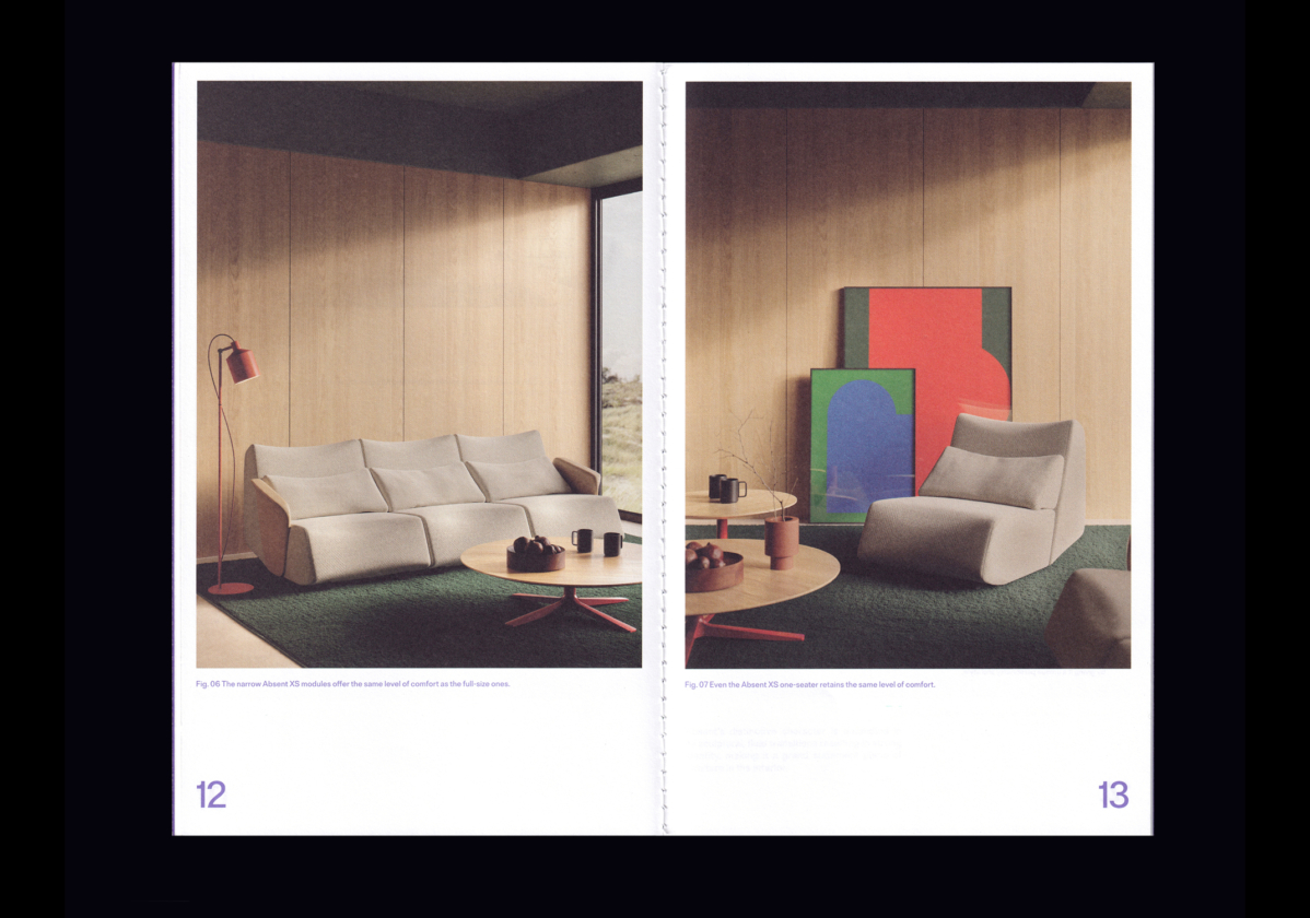
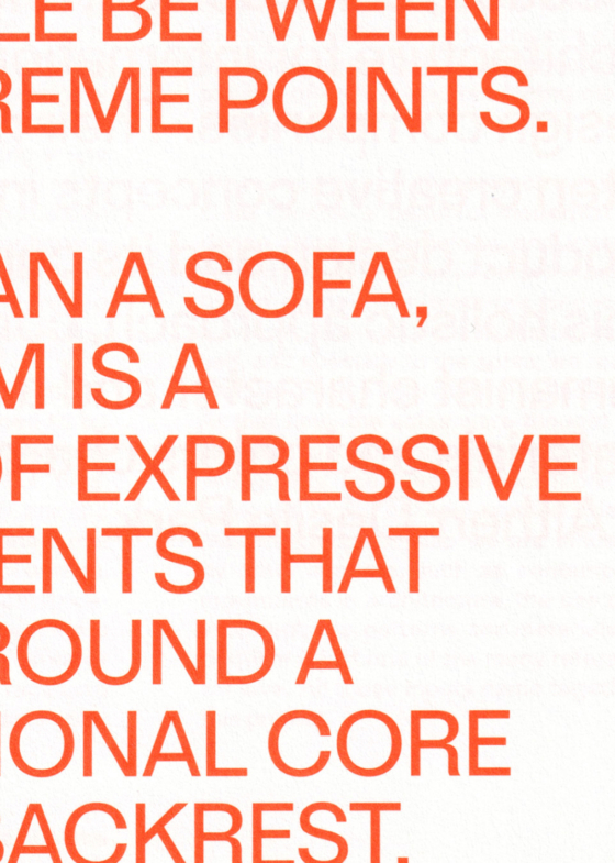
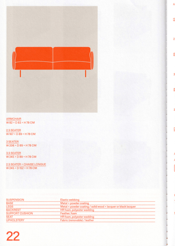
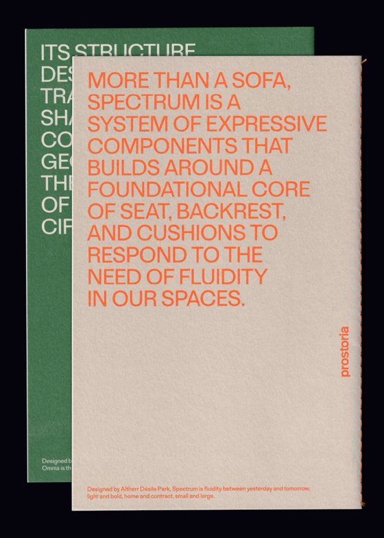
A modular brochure and catalogue system extends Prostoria’s constructivist identity into editorial design. Each collection is distinguished through specific colour pairings, while typography and layout remain consistent, structured and dynamic. The result is a recognisable family of catalogues that balances clarity, impact and scalability across product lines.
Digital
Web
A dynamic, constructivist website translates Prostoria’s visual identity into a digital brand experience. Strong typographic blocks and architectural layouts create a clear navigation structure that balances graphic impact with usability.
The site presents Prostoria’s full product portfolio, including extensive configuration options and the ability to save customised selections to a wishlist. The chromatic system was also expanded, building a broader set of colour combinations that extends the corporate palette and adds flexibility across the interface.
Graphic Design & Art Direction: @clasebcn
Creative Direction & Content Art Direction: @altherrdesilepark
UX & Coding: @netgen.io
UI & Design: @julia.gavalda
Product Rendering & Configurator: @polymachine_3d
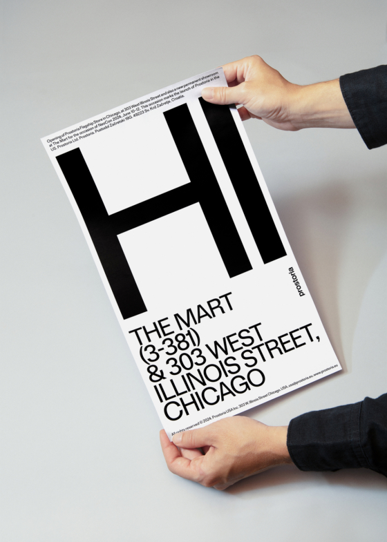
Flagship Store & Showroom
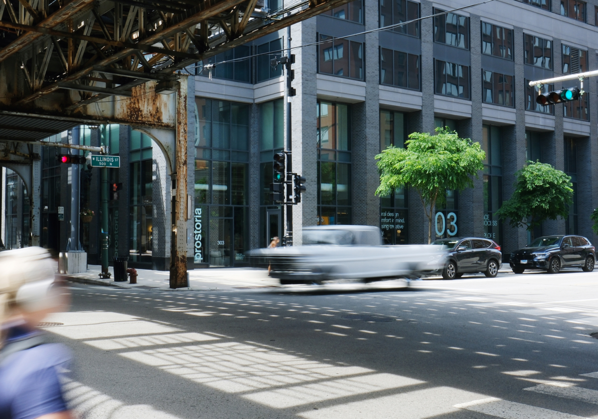
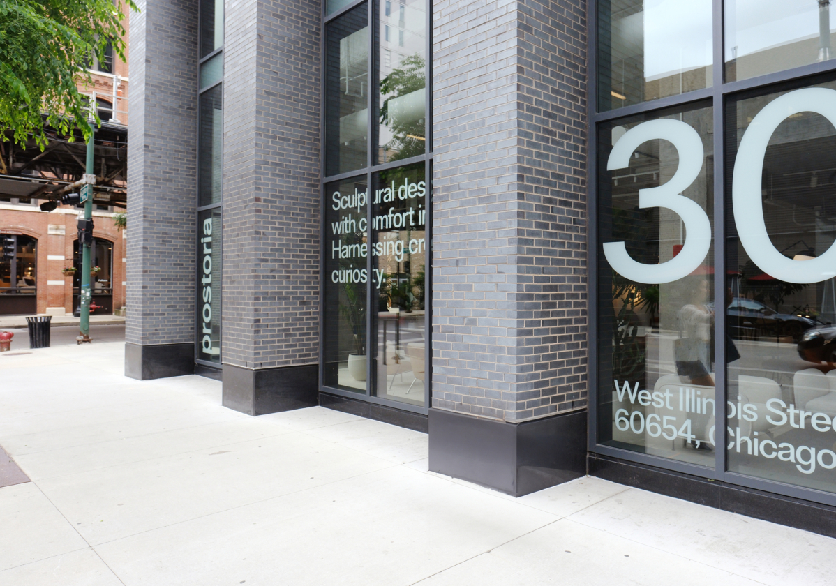
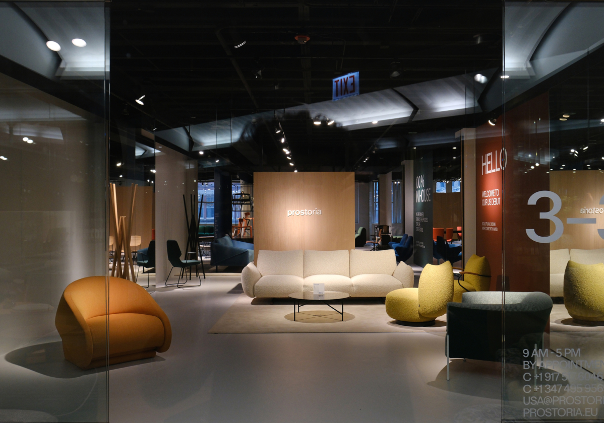
Prostoria’s first North American flagship store opened in Chicago’s River North district (303 West Illinois St), alongside a permanent showroom at The Mart, unveiled for NeoCon 2024.
Environmental graphics were designed for both exterior and interior applications, using the constructivist typographic system to communicate Prostoria’s story, key messages and brand voice across physical space.
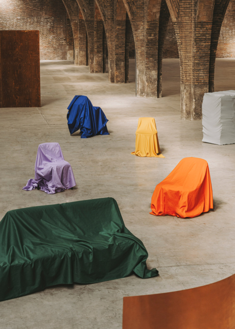
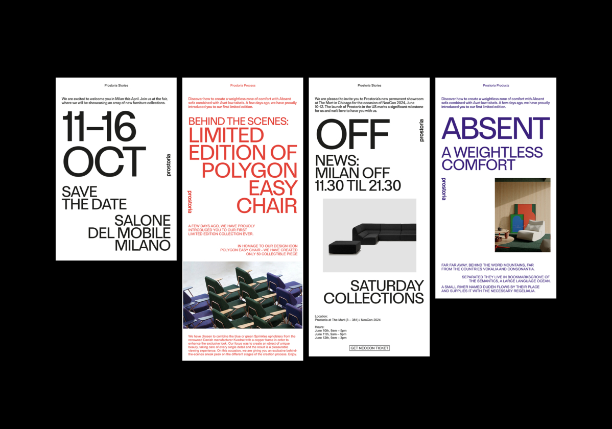
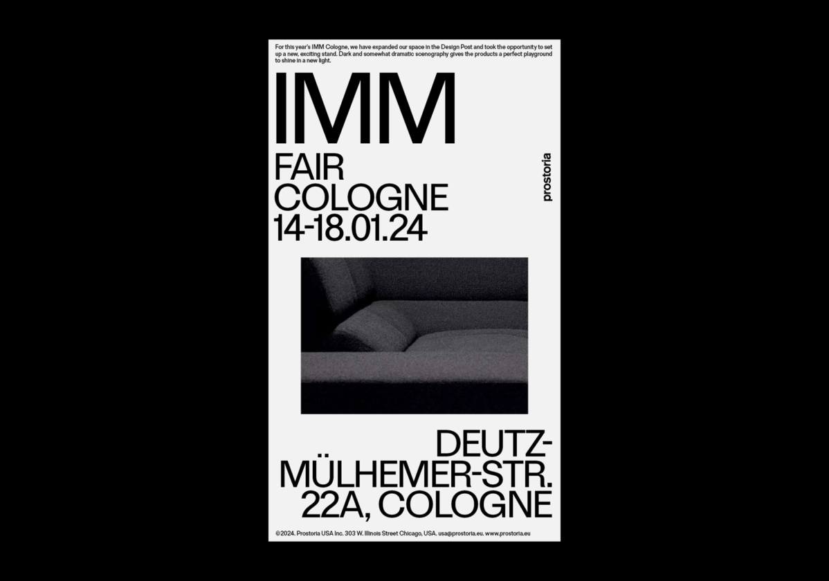
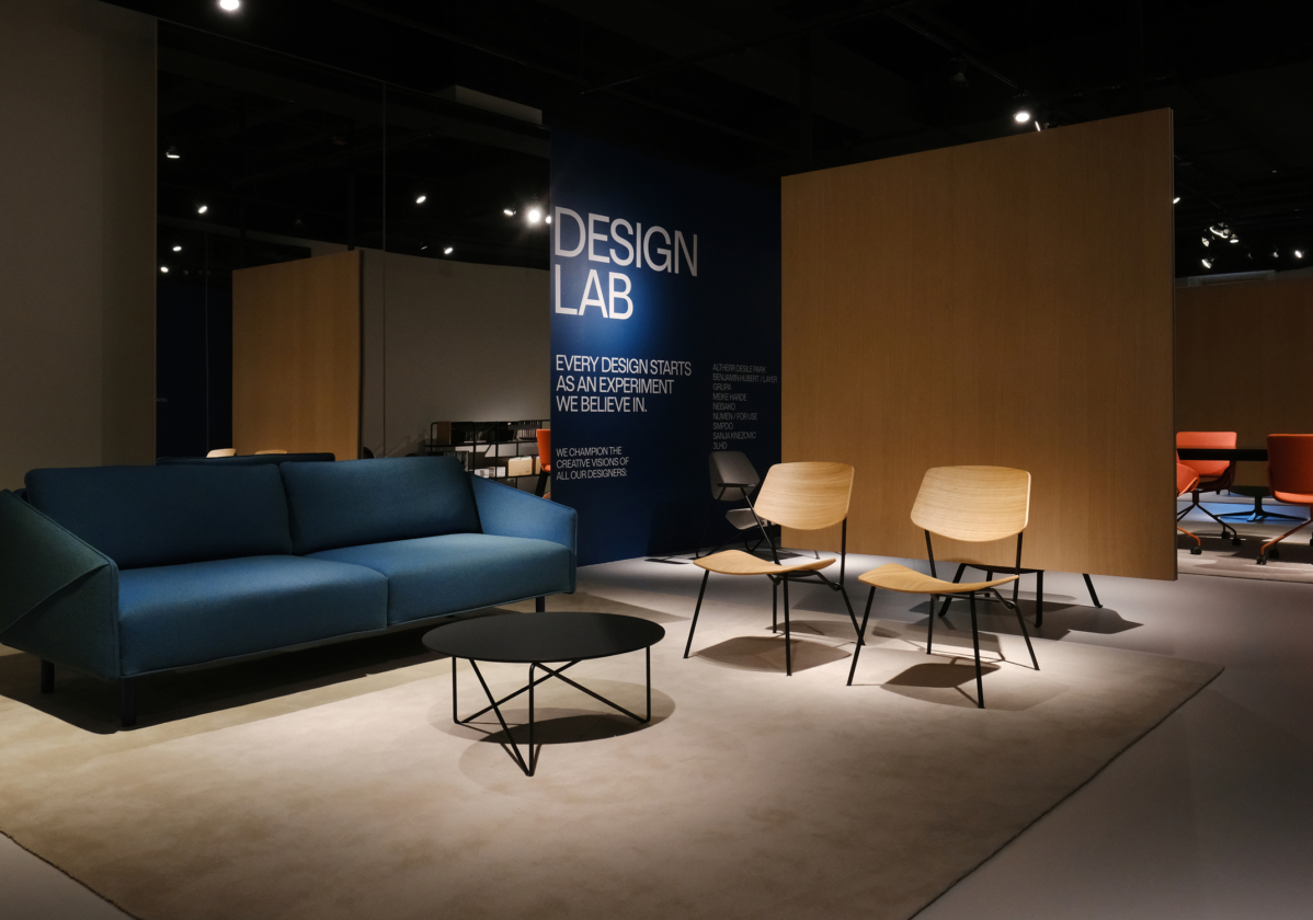
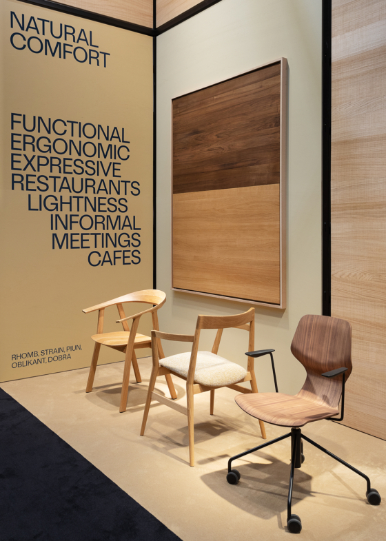
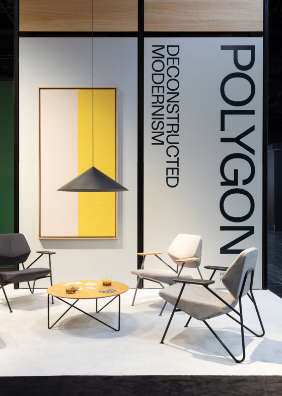
Stands
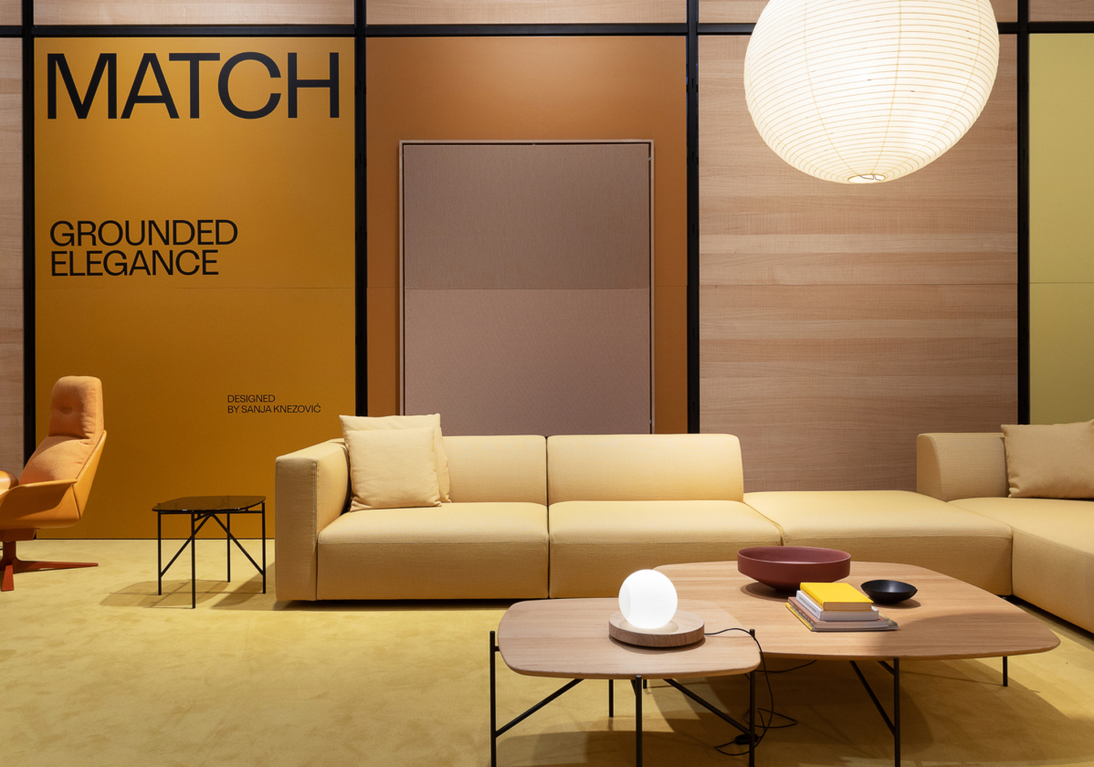
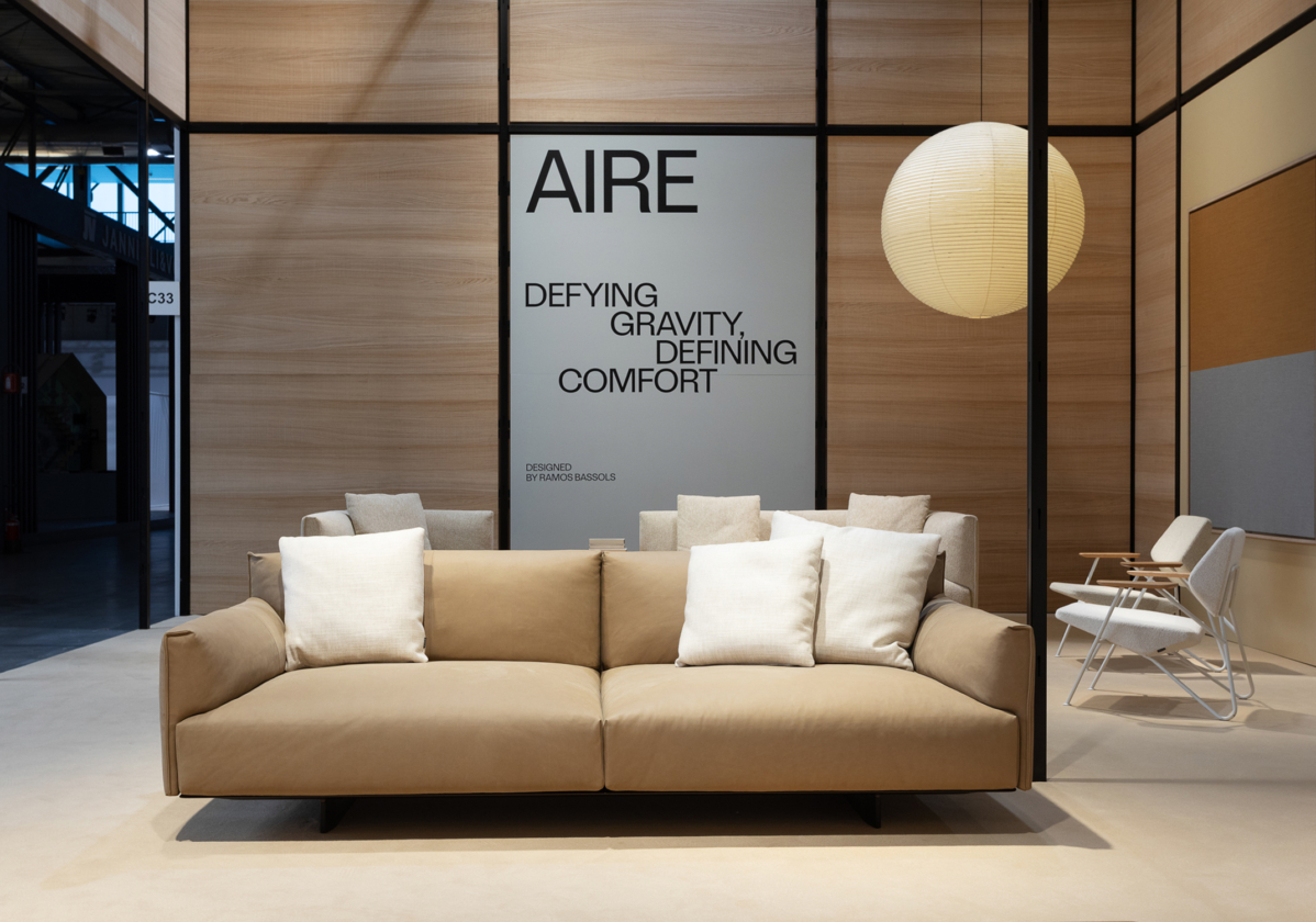
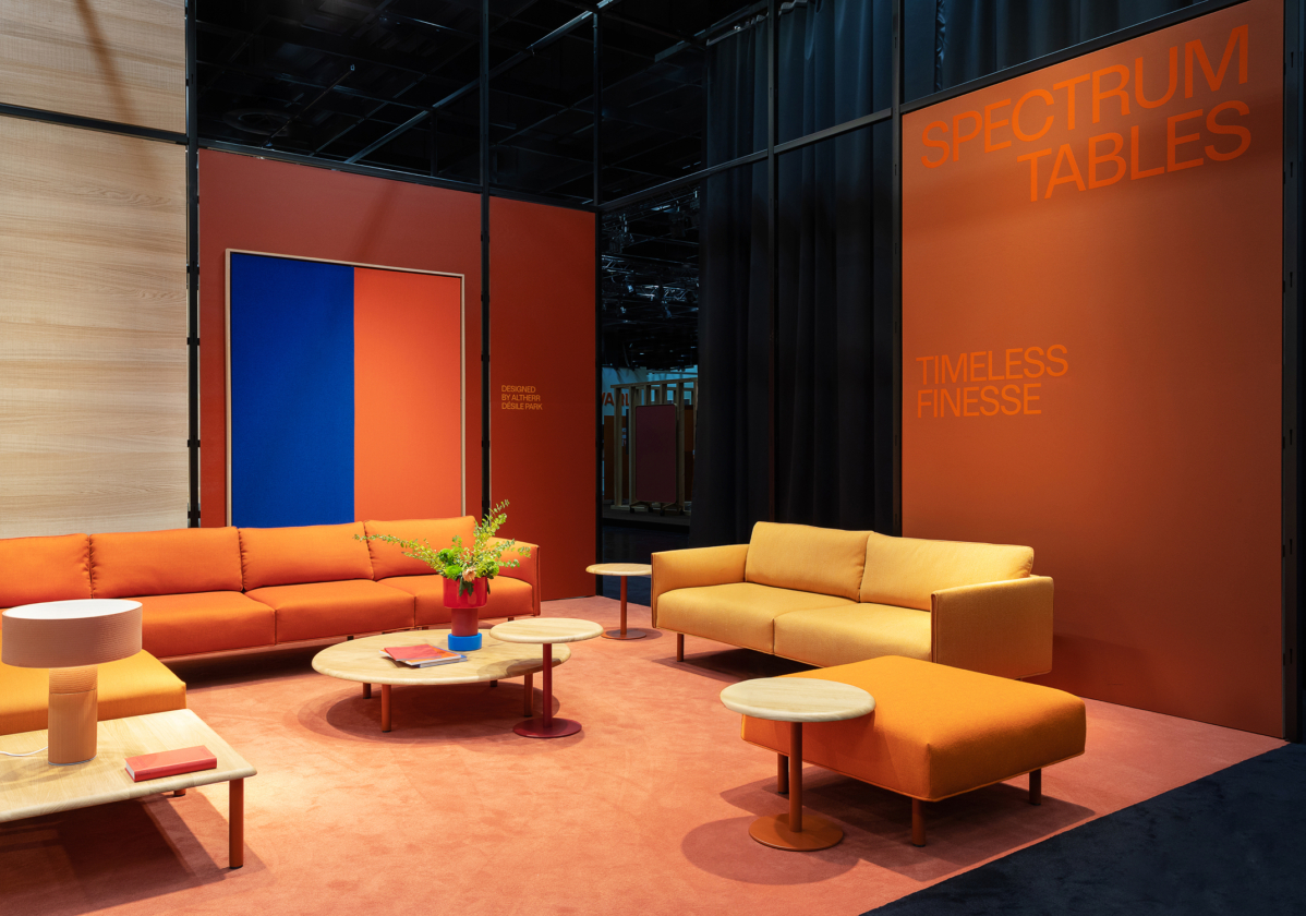
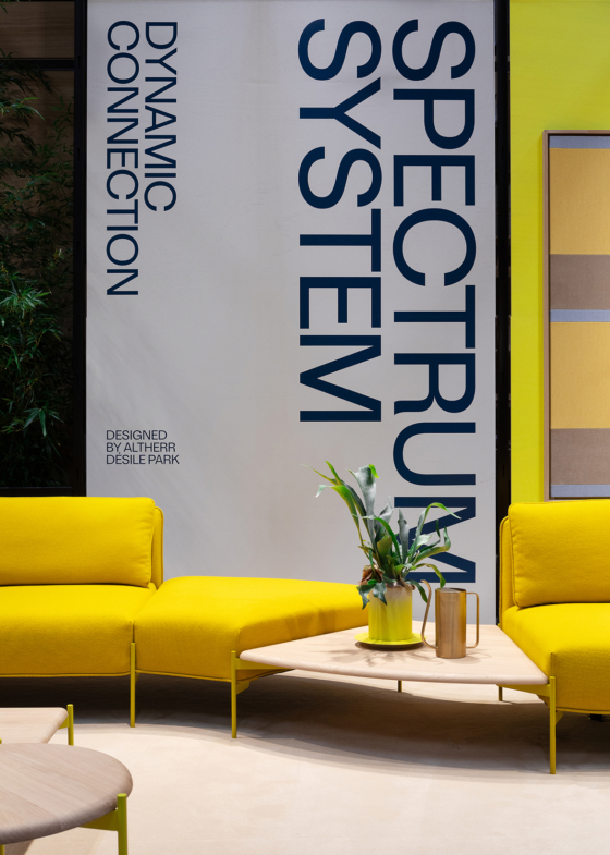
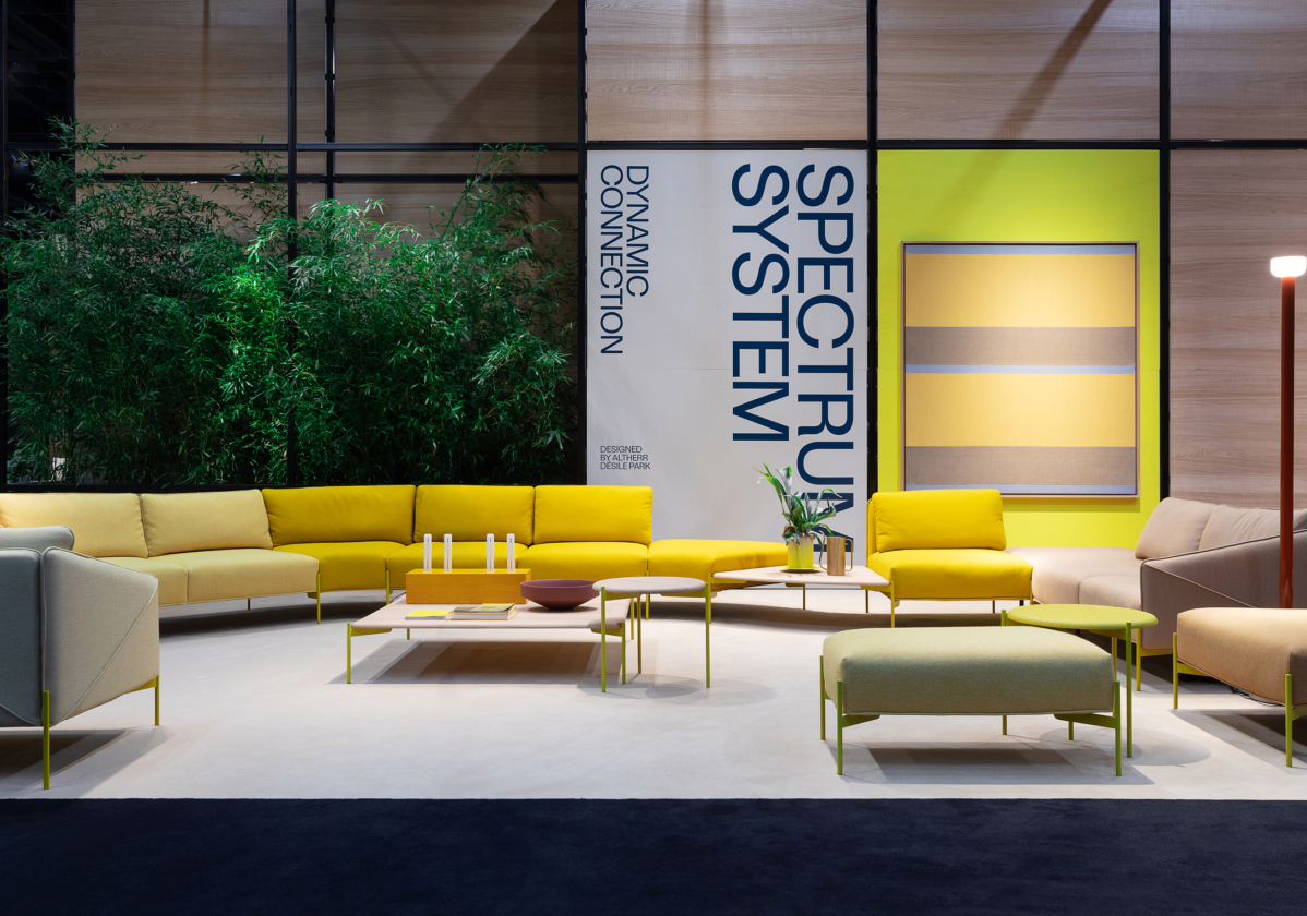
For Salone del Mobile 2025, Prostoria’s exhibition reflected the brand’s mix of Mediterranean warmth and continental pragmatism. The collection was presented through a light spectrum of beige, yellow and orange tones, reinforcing a warm, Mediterranean-inspired atmosphere.
For Orgatec 2024 in Cologne, Prostoria presented an expanded contract furniture selection for hospitality and workplace environments. Environmental graphics for both stands followed the brand system, introducing product names and key descriptions with clarity and consistency, helping visitors quickly understand each collection and its benefits.
Stand Design: @altherrdesilepark