


Teixidors works with quality materials and artisanal sustainable processes to create home textiles that improve people’s quality of life. While keeping the local handloom tradition alive, they make products that bring a sense of ethics and aesthetics to our daily lives.
To visualize their brand philosophy, we have approached the creative direction through the connections between nature and sensations, transparency and culture, responsibility and craftsmanship.
Identity
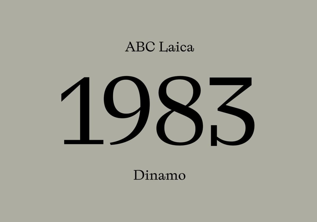
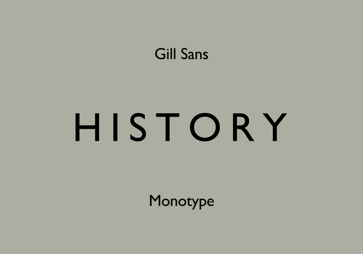
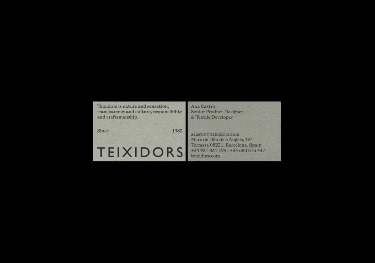
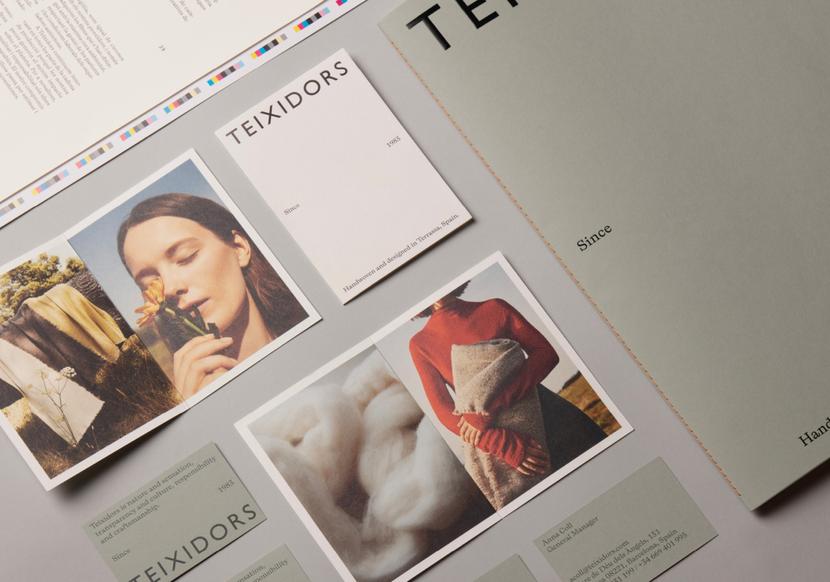
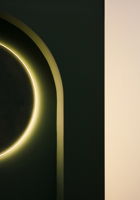
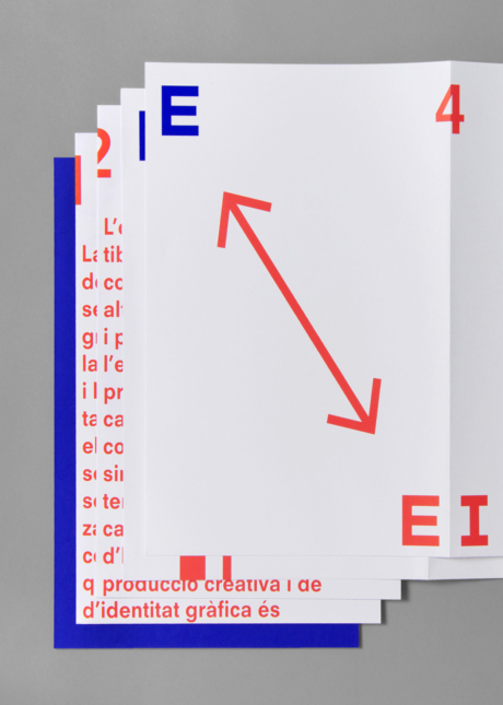
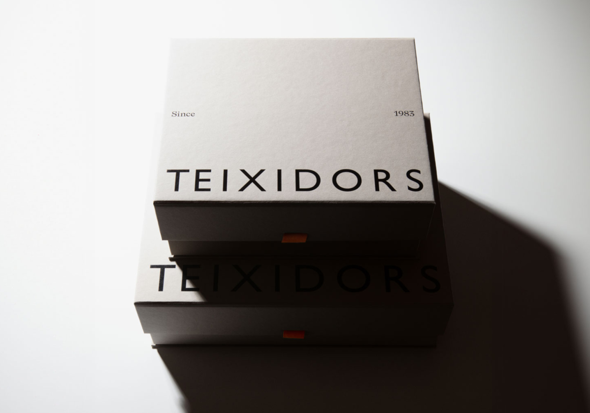
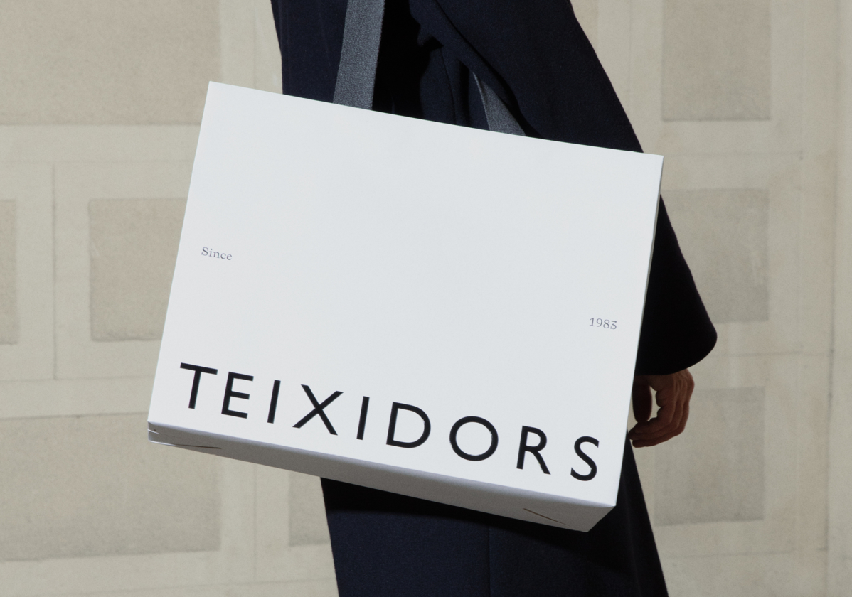
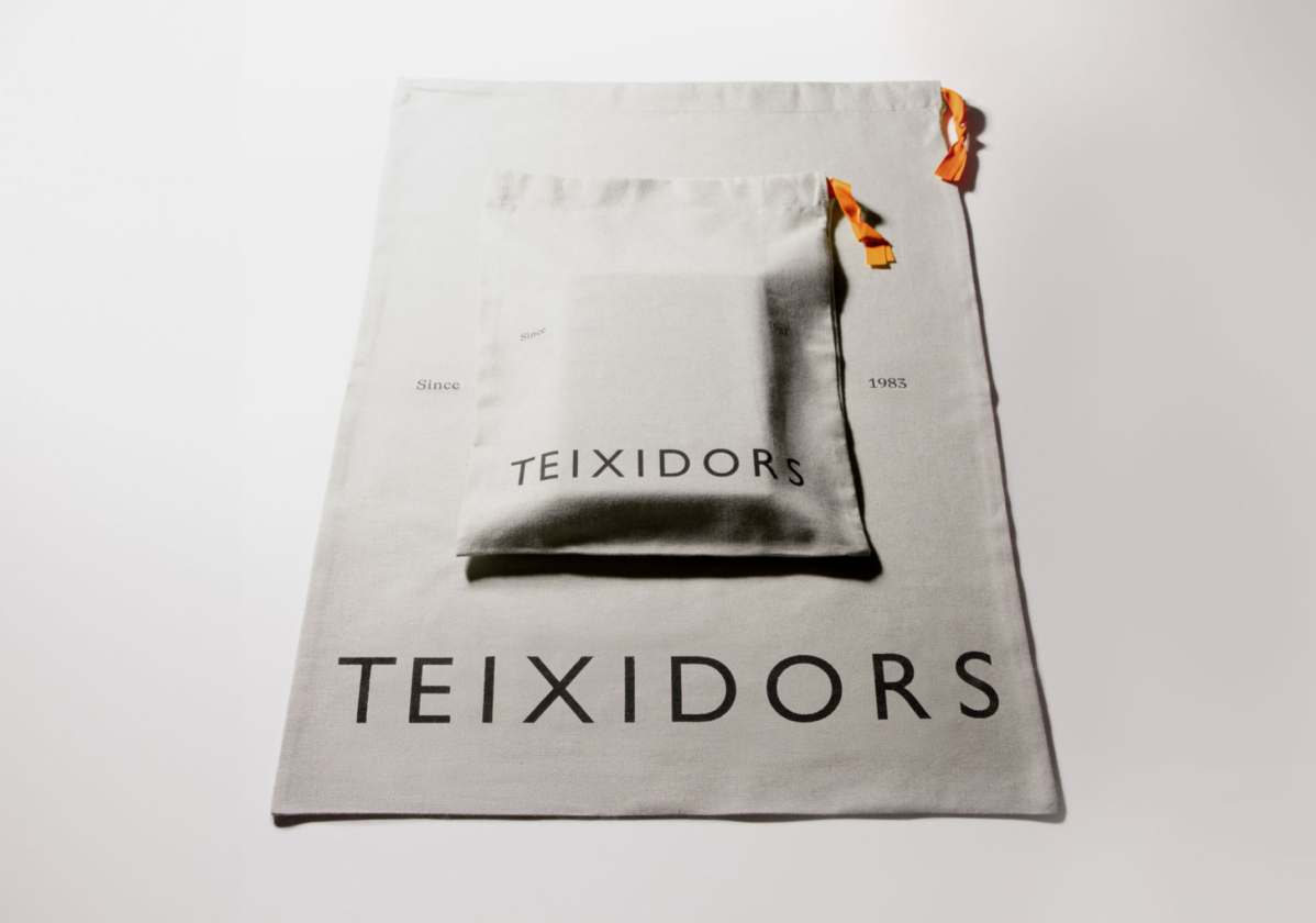
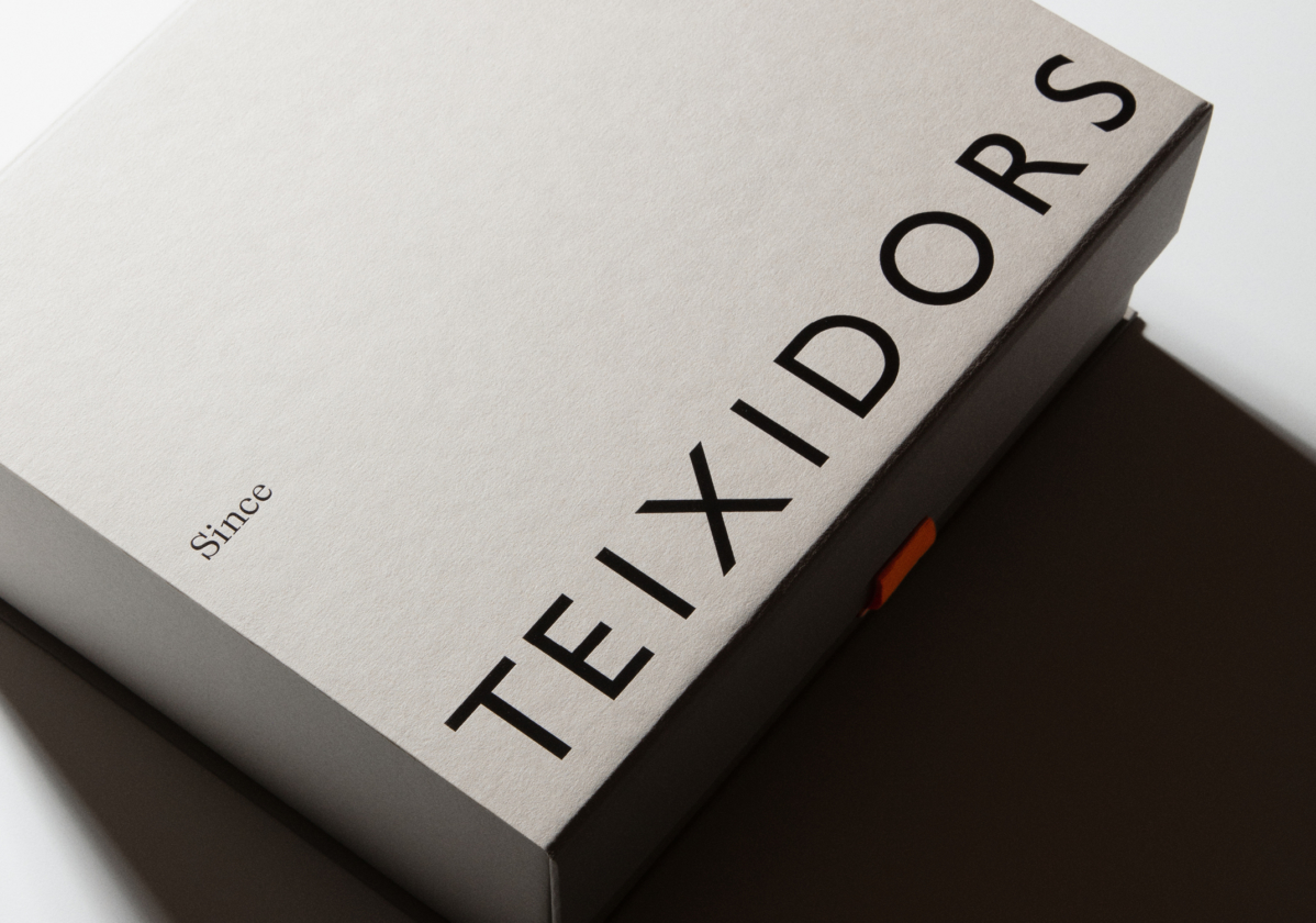
We revised its logo to achieve a graphic character more consistent with its values of quality, innovation and sustainability. We incorporated the ABC Laica typeface that enriches the language alongside the existing Gill Sans. Thus, we have evolved their identity through a richer, more personal and contemporary graphic language.
Art Direction
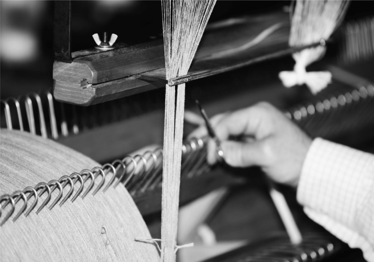
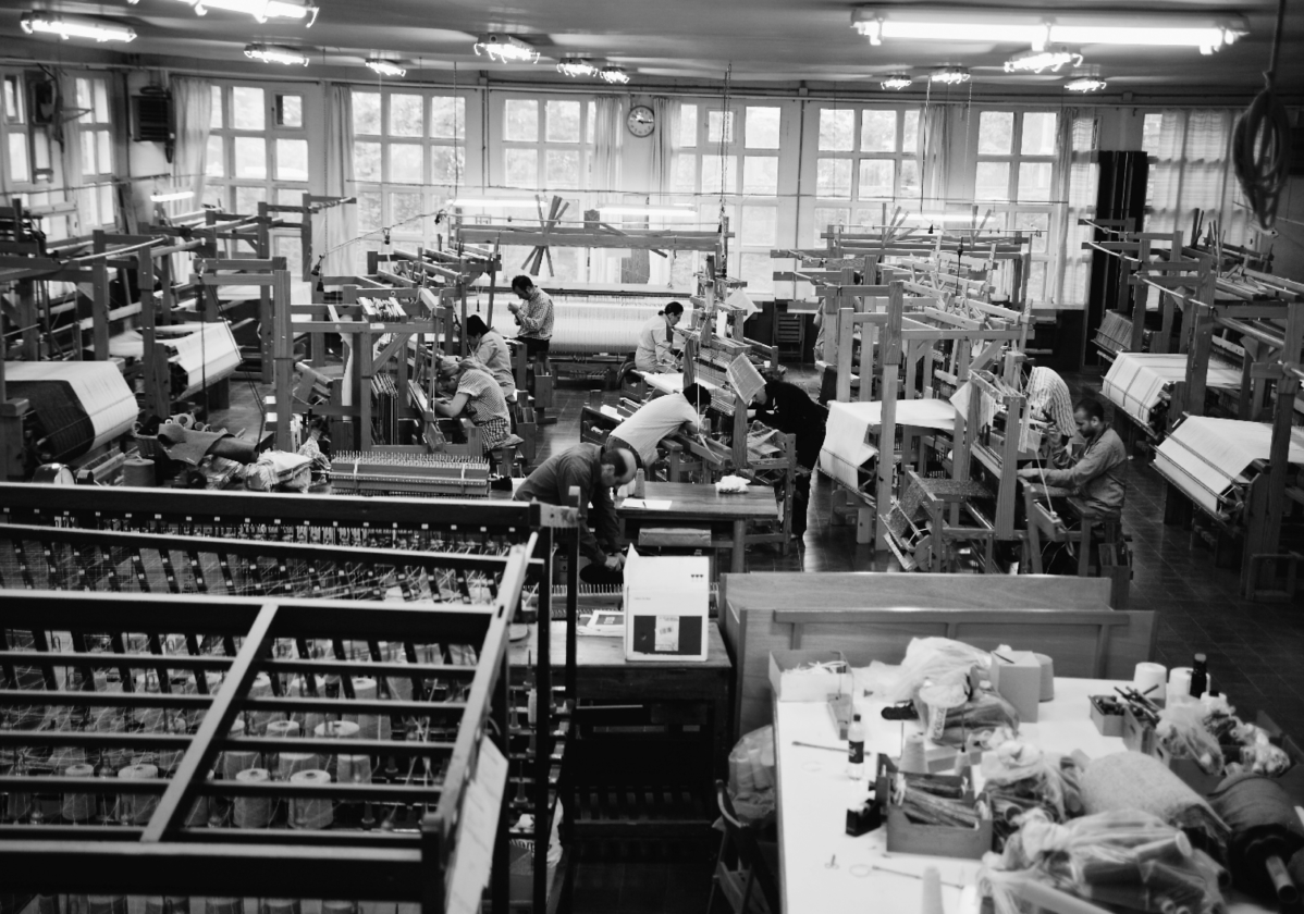
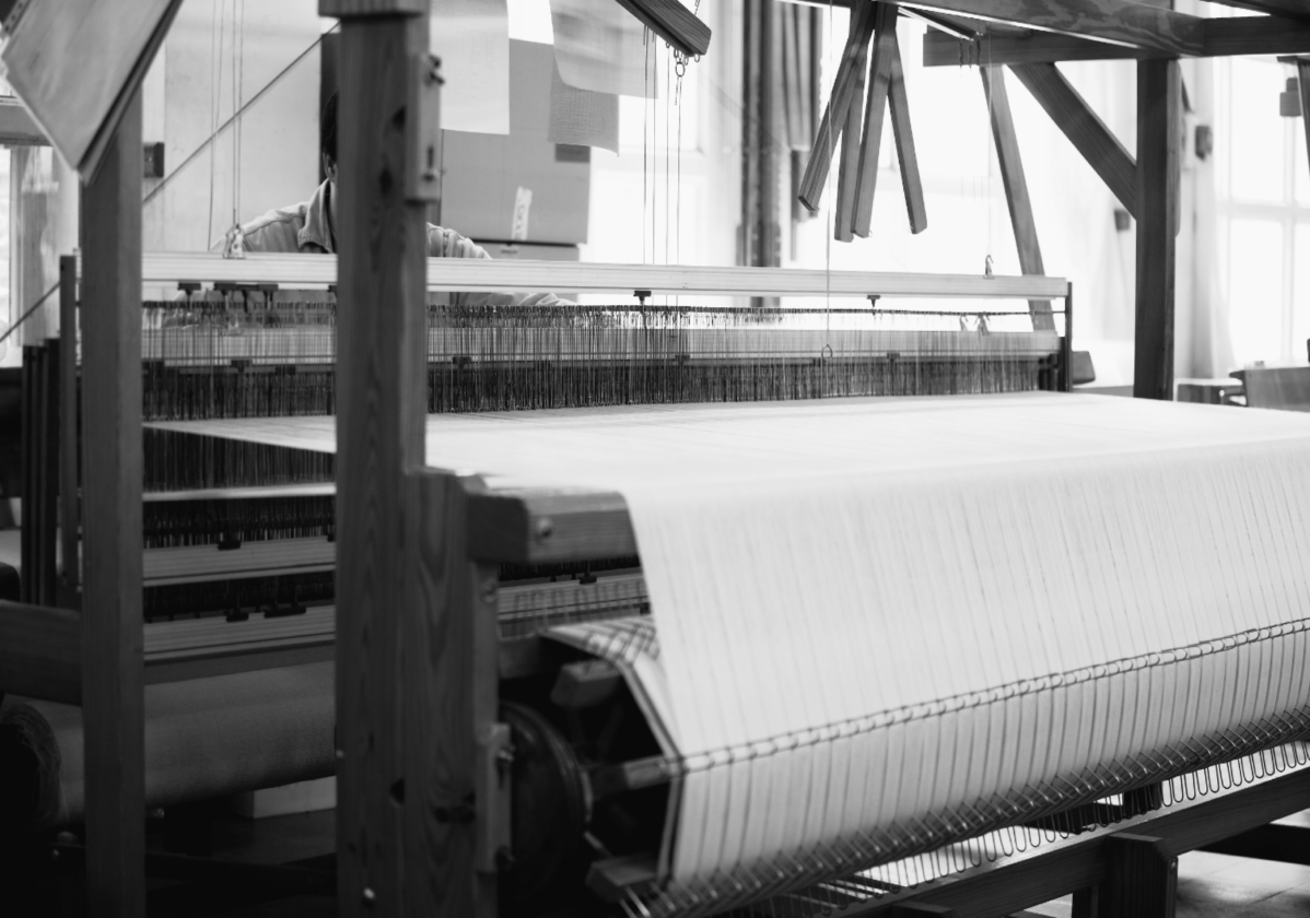
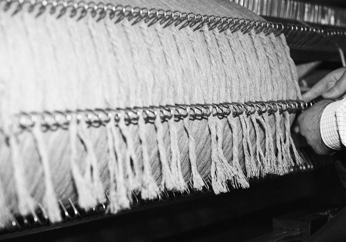
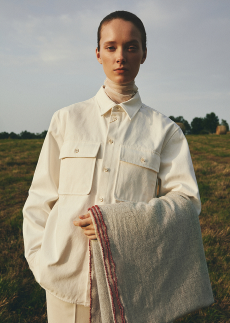
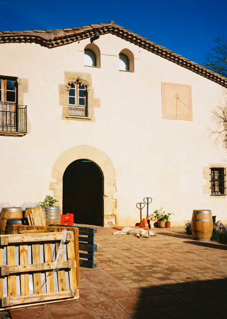
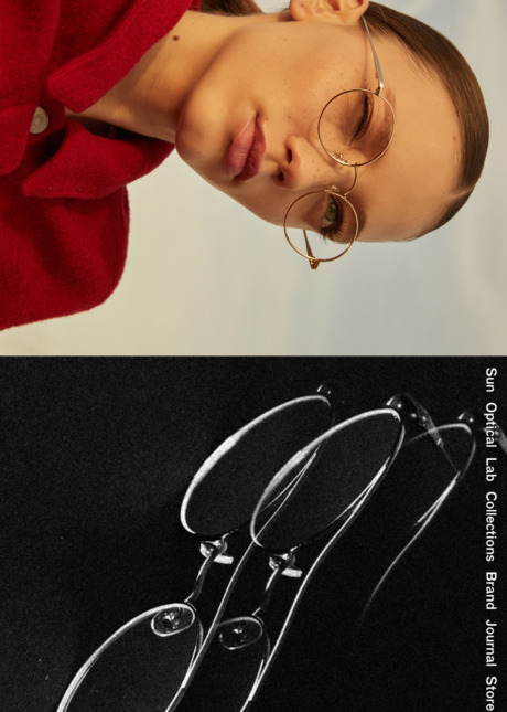
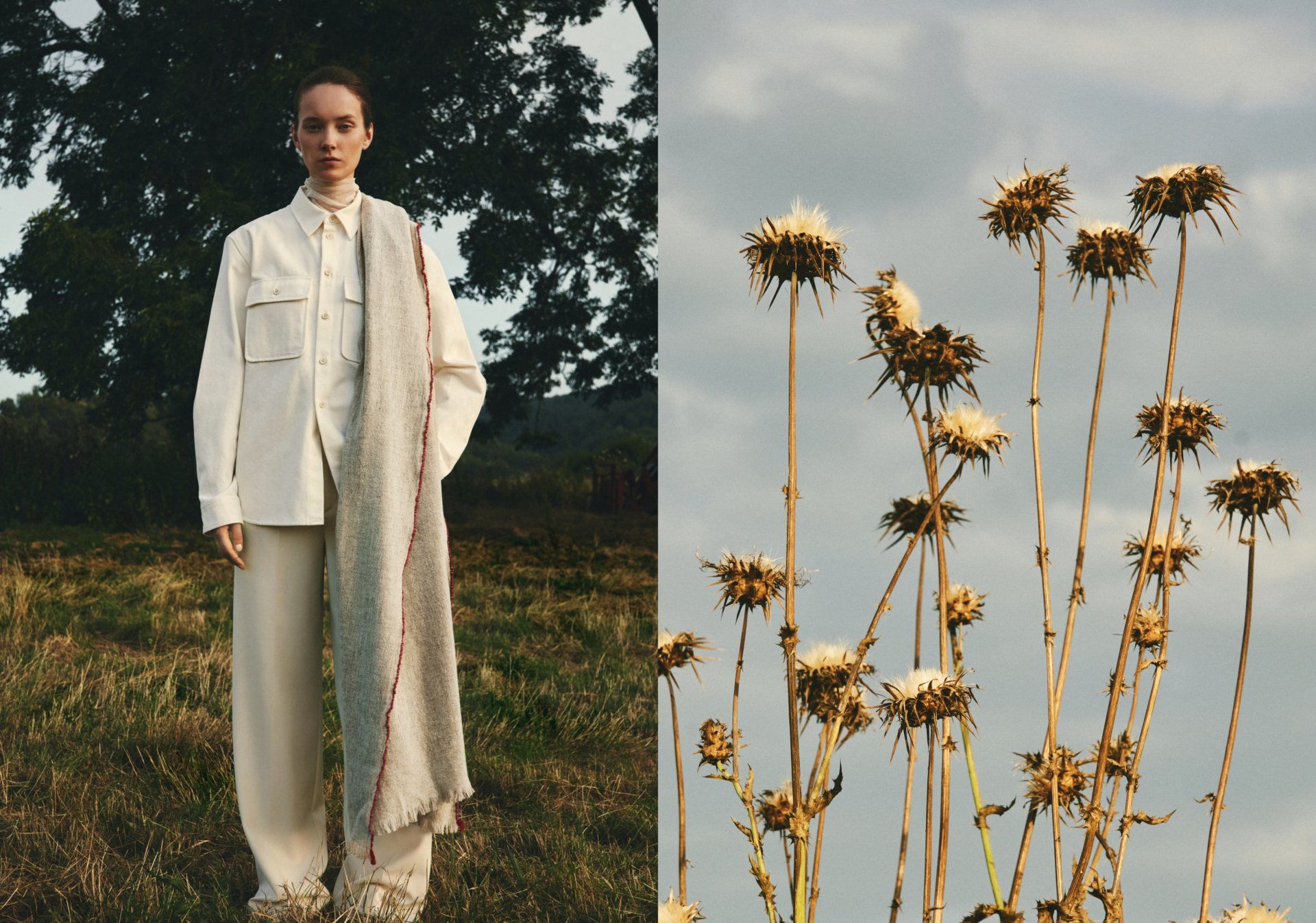
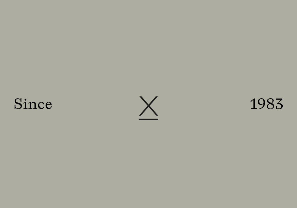
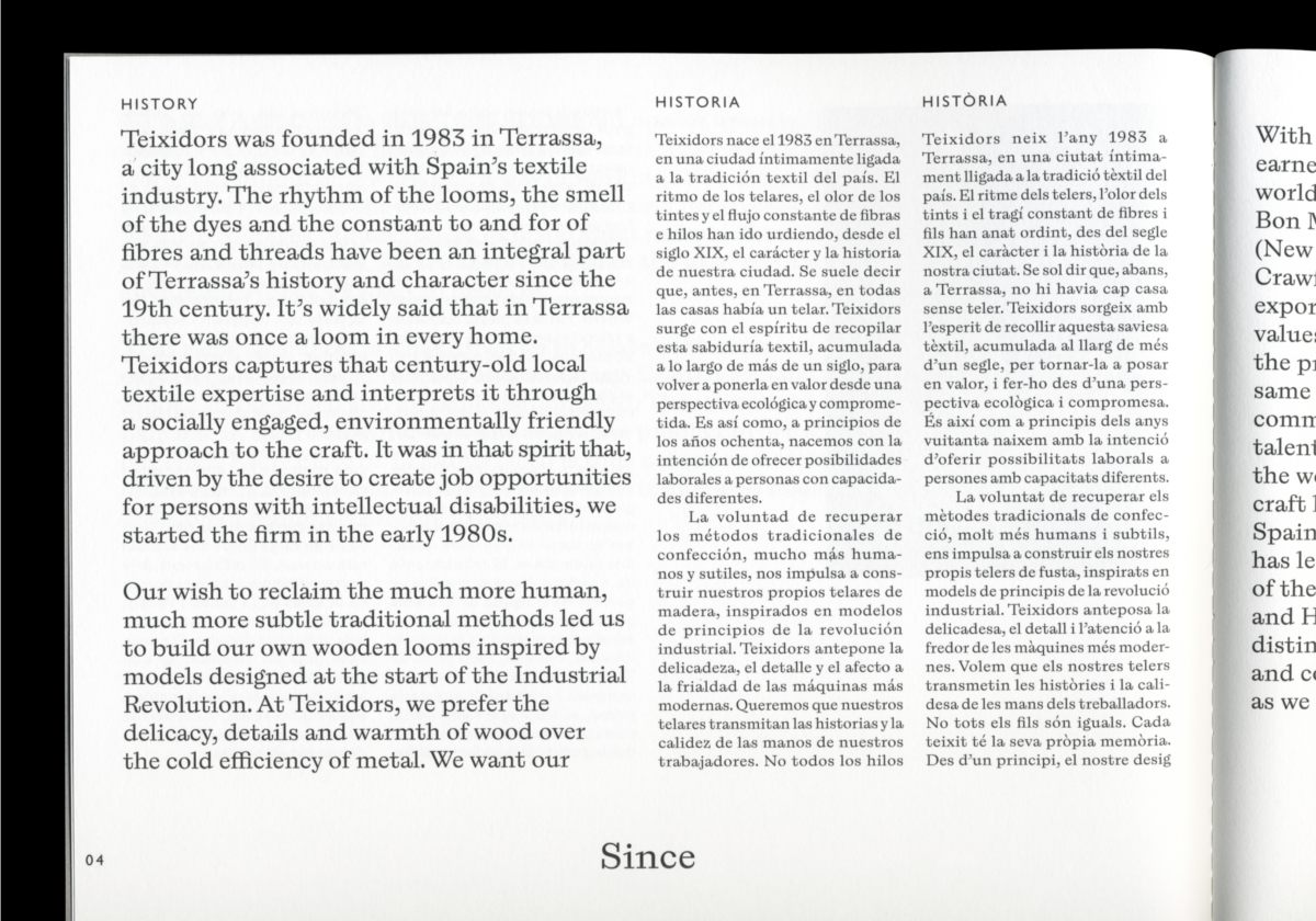
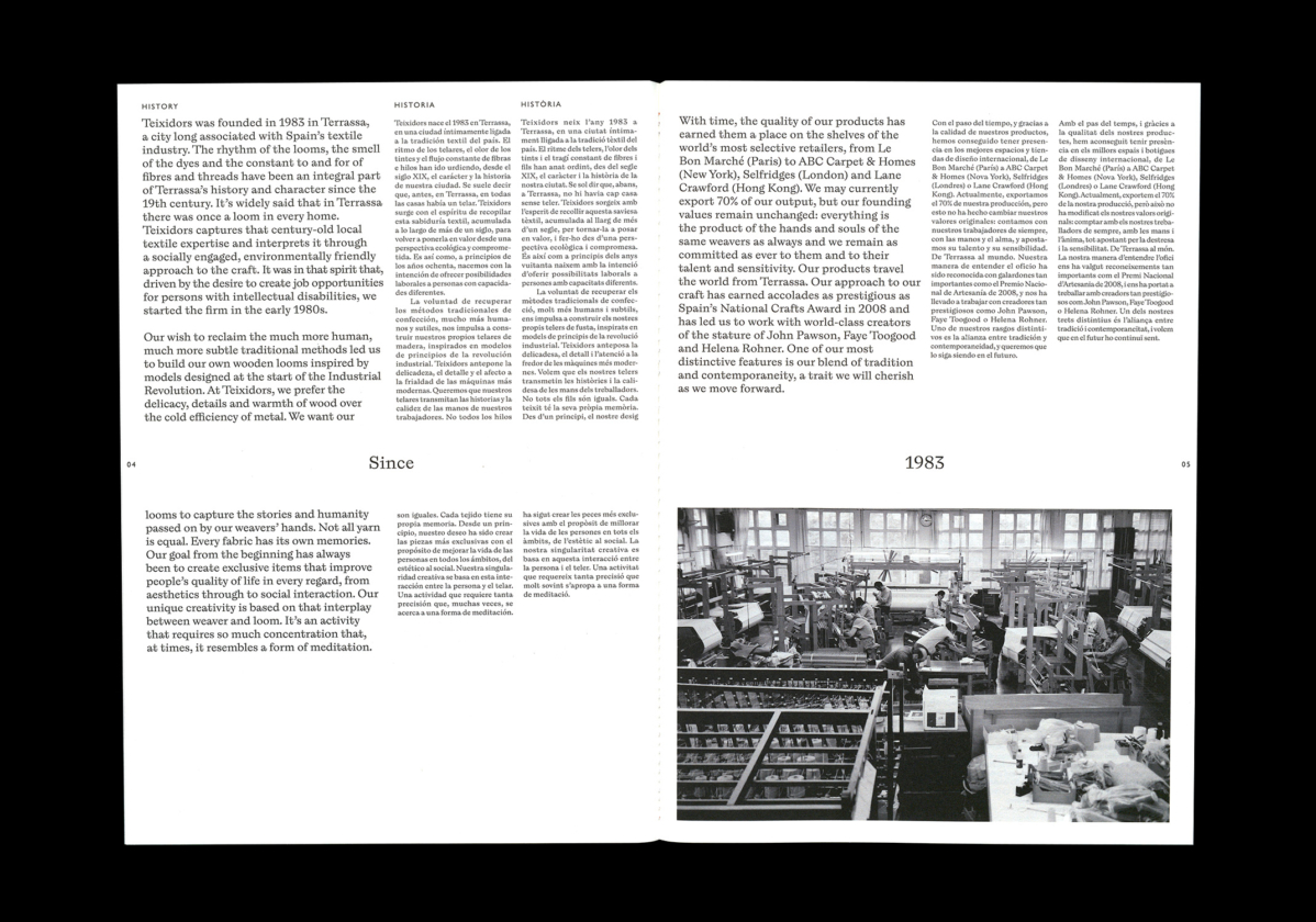
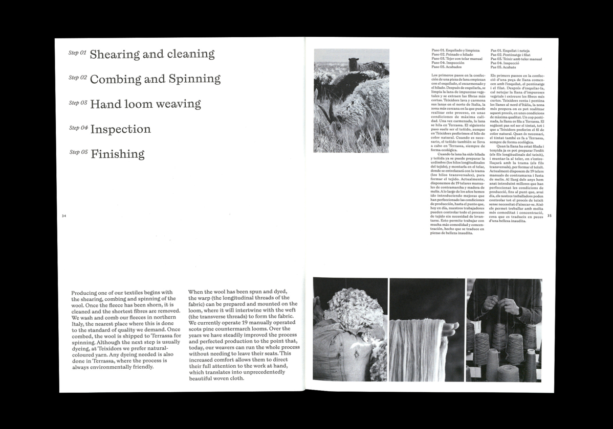
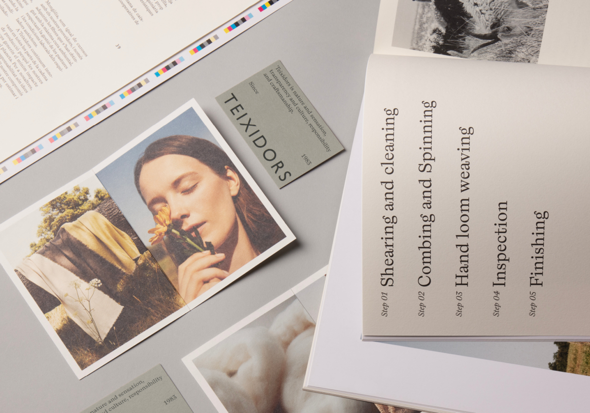
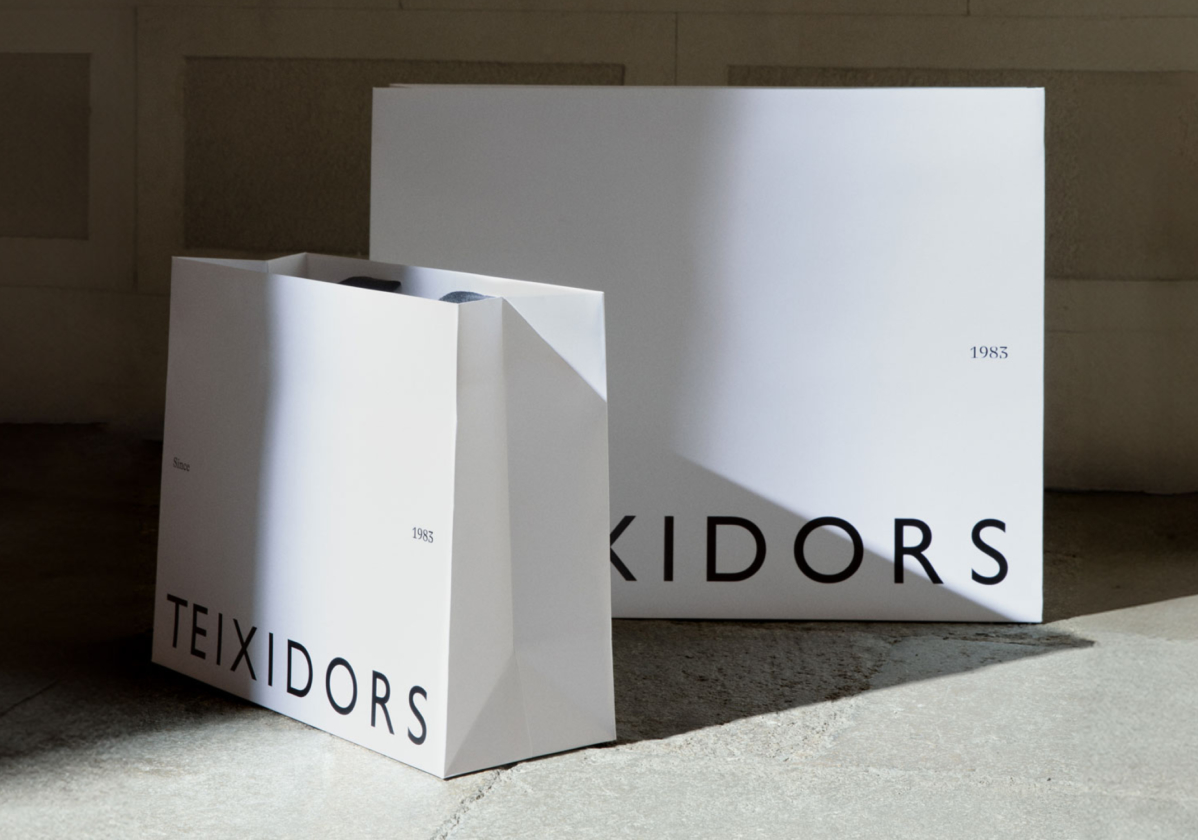
Teixidors was born in 1983 in Terrassa to preserve the traditional tailoring methods, creating its own wooden looms inspired by models from the beginning of the Industrial Revolution. To convey this traditional and careful character in their processes and history, we have opted for a treatment of black and white images and a documentary type of photography without artifice.
Photography: Daniel Riera
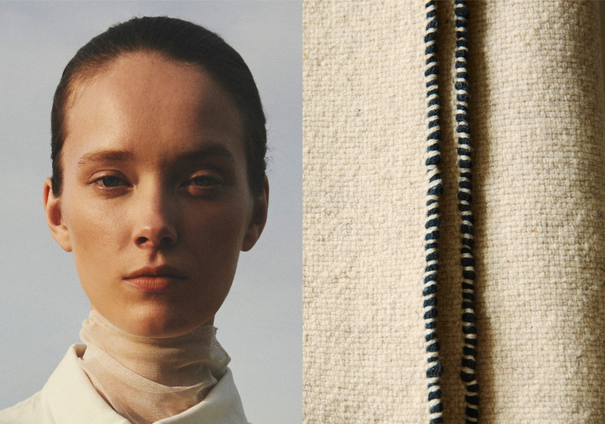
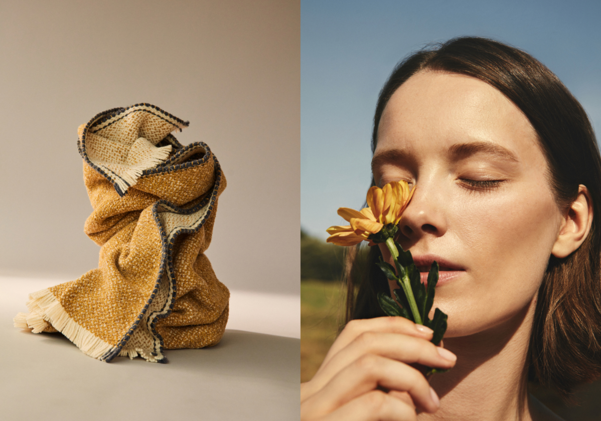
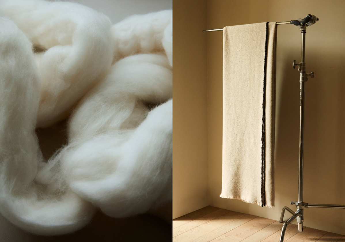
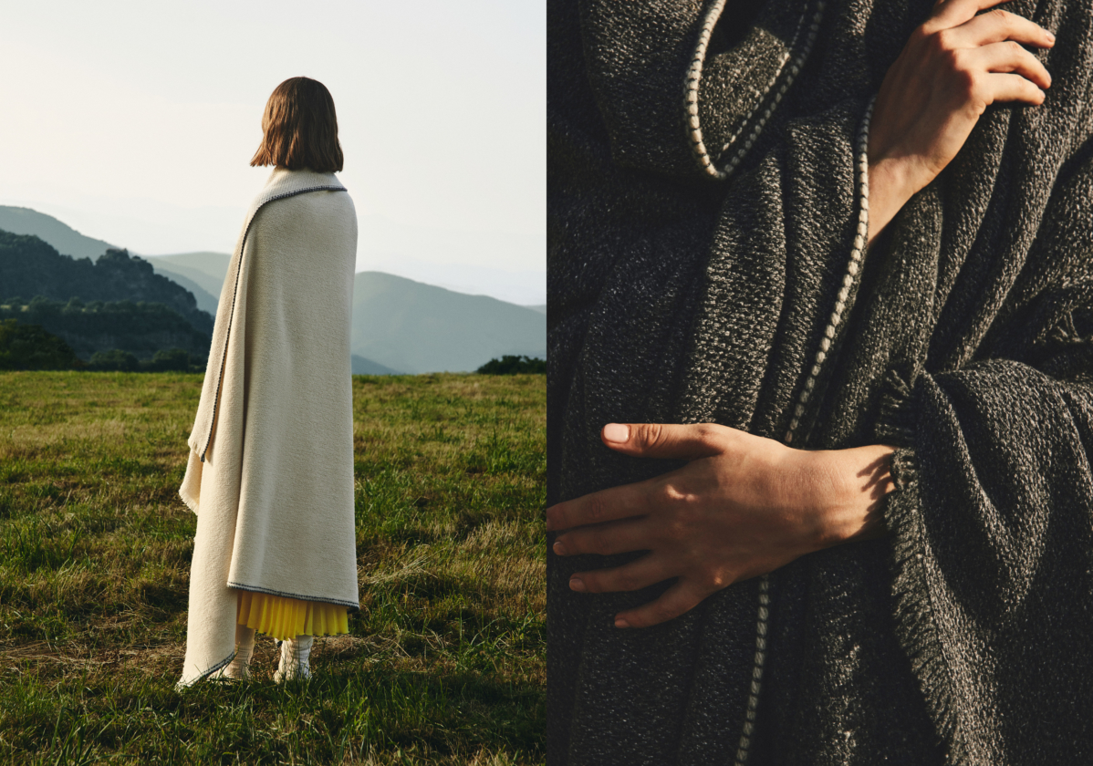
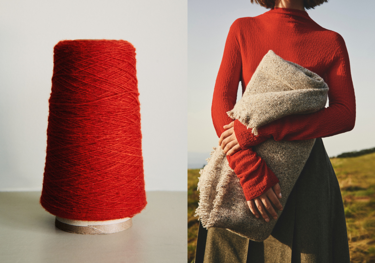
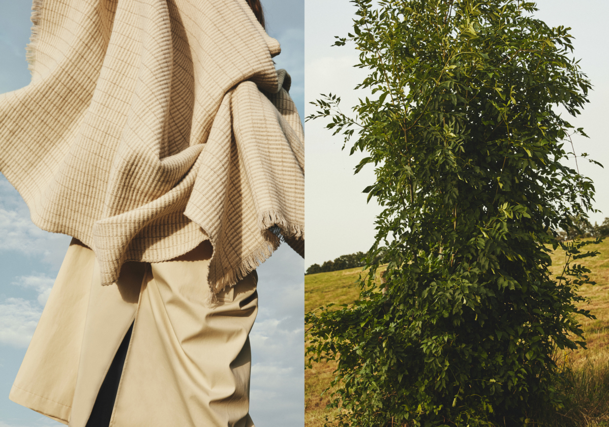
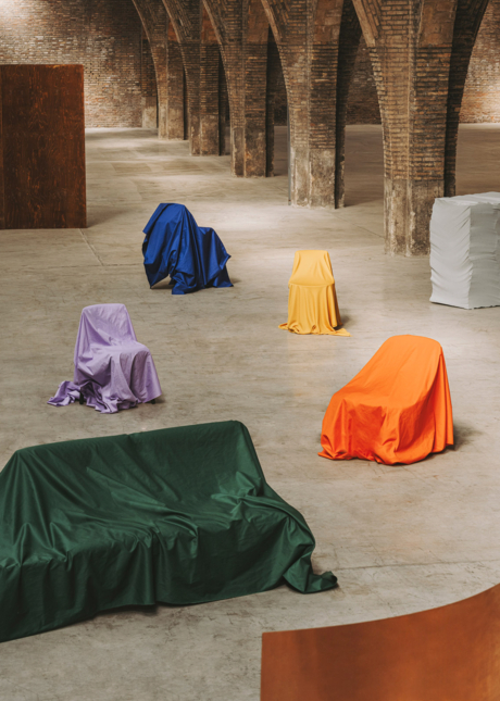
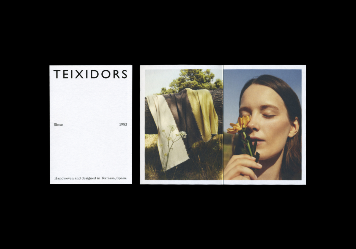
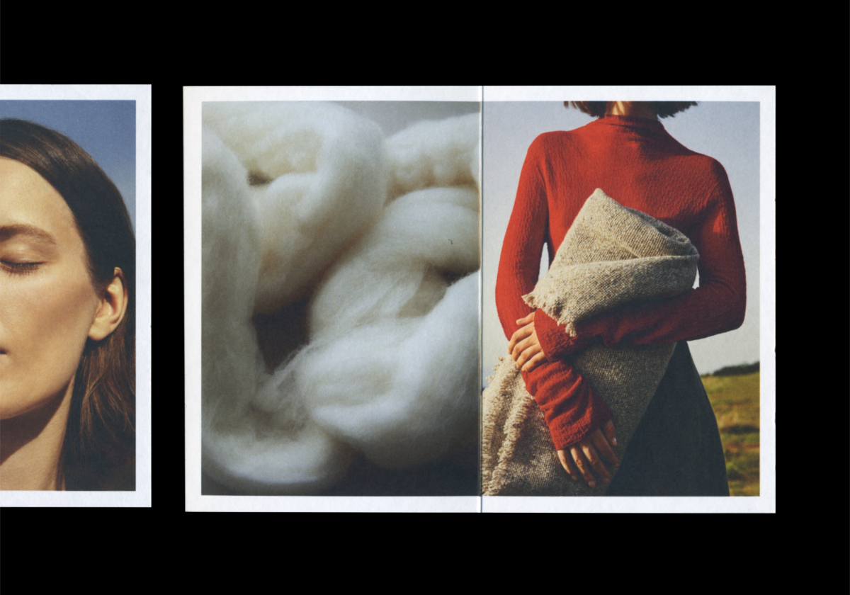
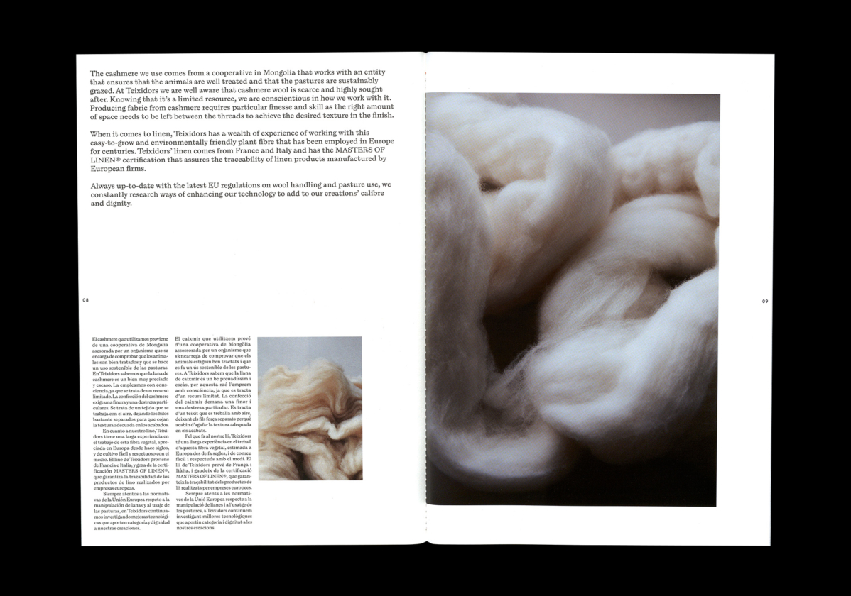
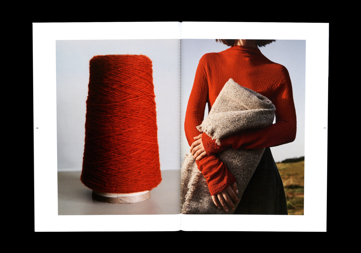
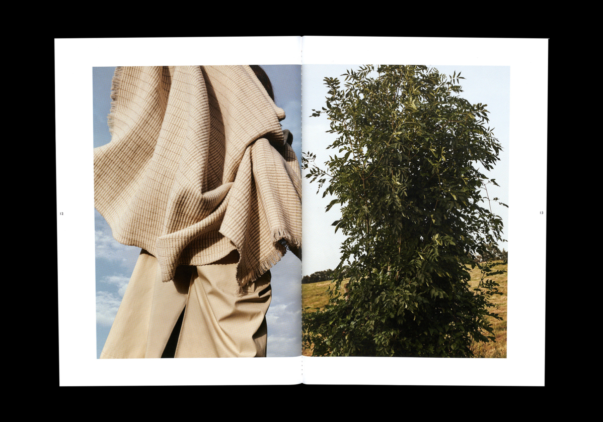
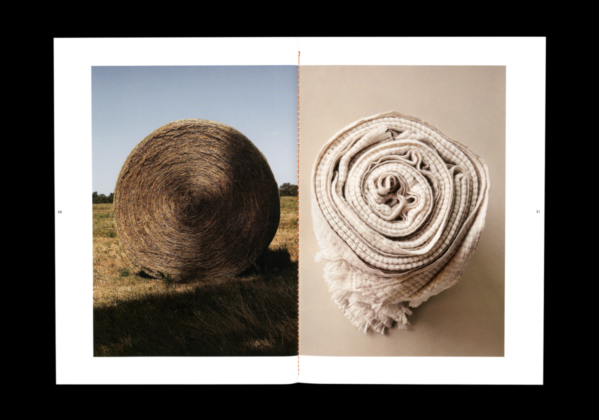
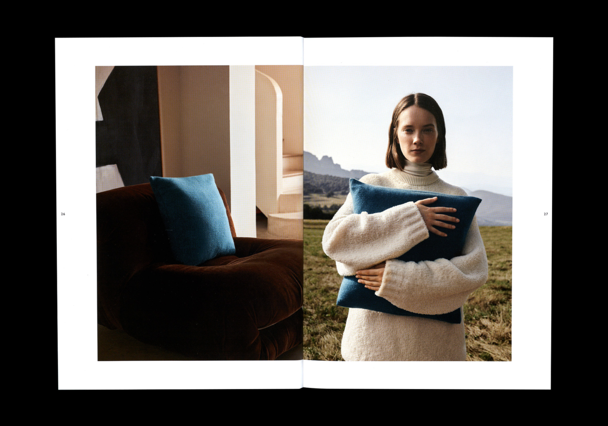
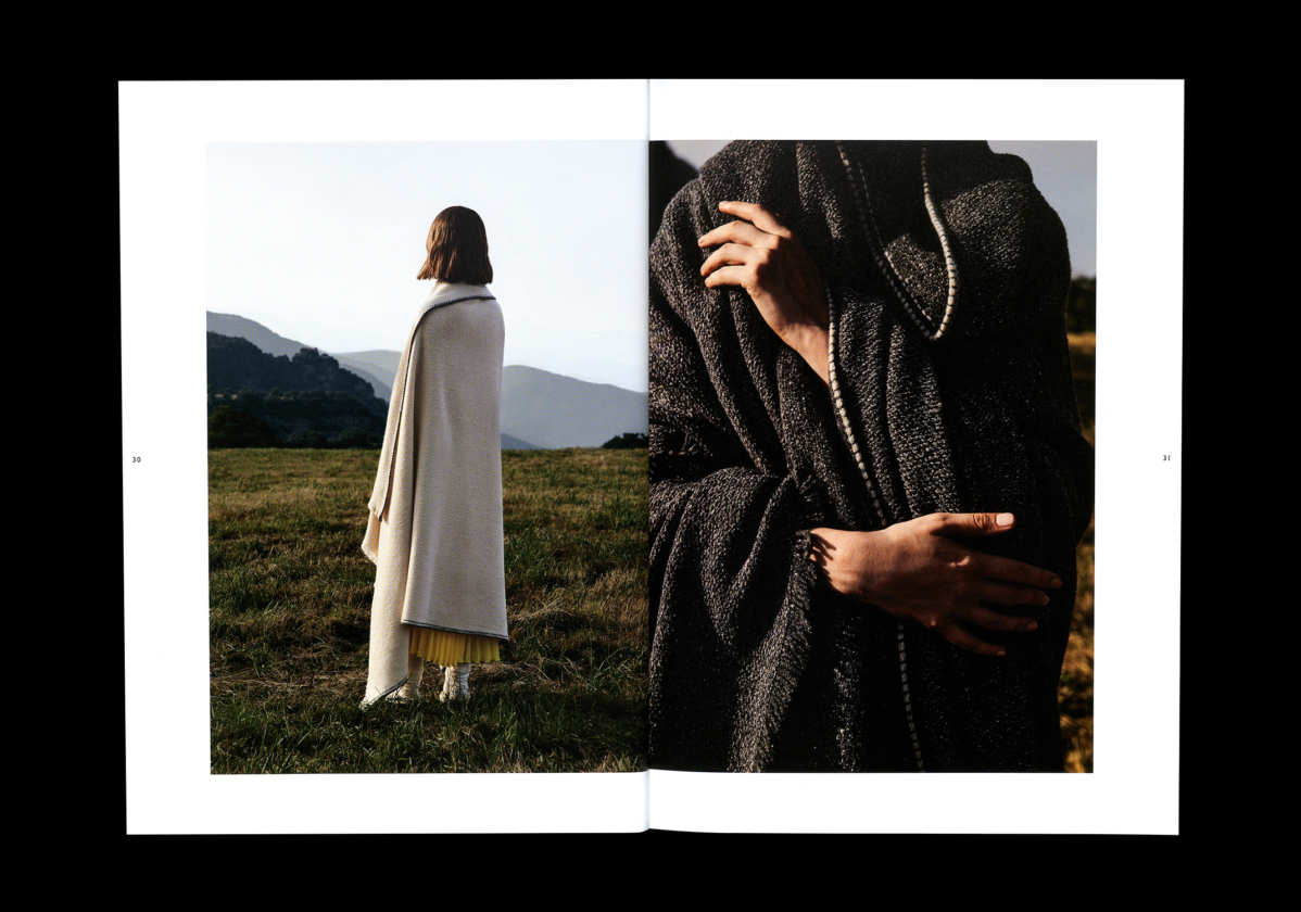
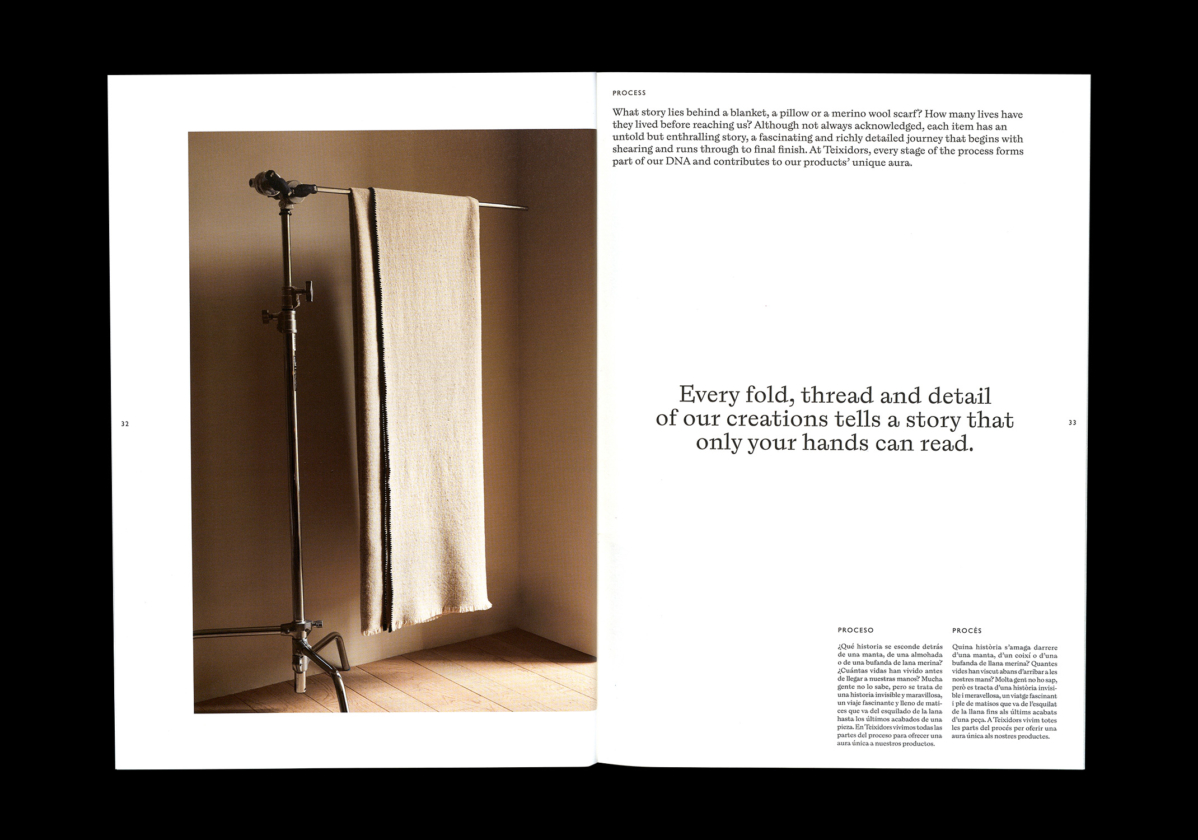
For the art direction of their new communication, the challenge was to bring the brand closer to the consumer and raise its qualitative perception. To achieve this, we saw the need to highlight the quality of its products, its relationship with the natural and sustainable, as well as its interest in materials of proximity. With this premise, we created a dialogue of images in which Texidors’s respect for nature, culture and humanity is evident.
Photography by Wai Lin Tse
Set Design by Adriano Escribano
Stylist by Débora Traitè
Catalogue
Copywriter: Gabriel Ventura
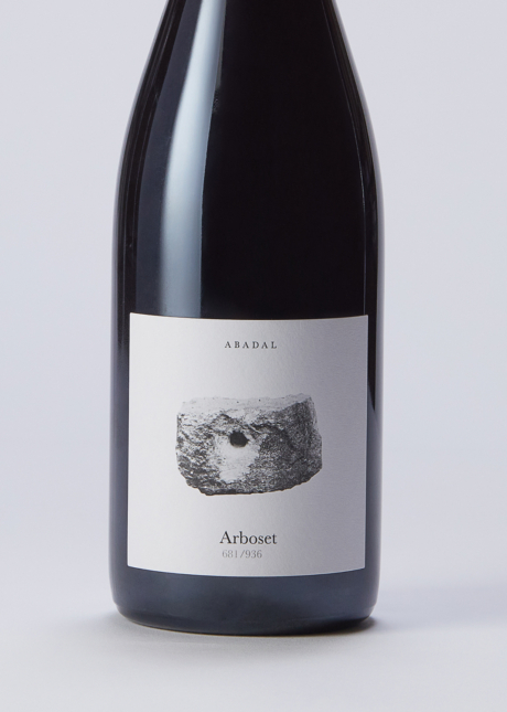
Packaging
Website
Programming: Ignite