


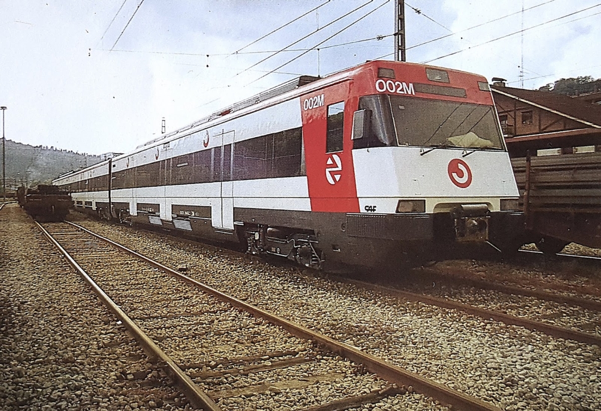
Created in 1989 by Alberto Corazón, the brand Cercanías (surroundings) responded to RENFE’s need to systematize the signage and communication of all the railway networks that were deployed around every Spanish big city. Despite initially consisting of a C letter inscribed in a circle, language differences forced the symbol to be abstracted, something the designer solved by turning the letter 135º, creating an icon that would travel alongside Spaniards for more than 30 years.
‘Tip of the Week’ is a weekly insight to some of the things we like.